Preview image. Unlock full-res
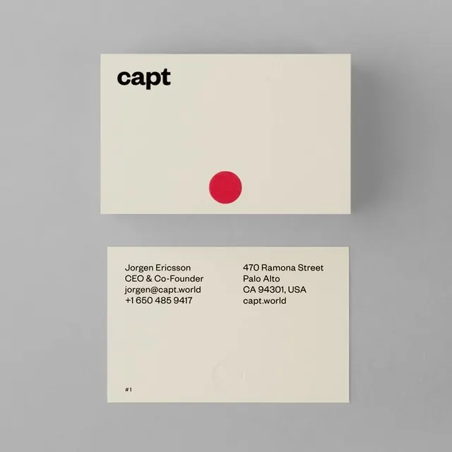
A two-sided business card set in beige with black sans-serif type, a single red circular accent, and asymmetric layout showing name and address.
Summary
Two-sided business cards for Capt featuring beige backgrounds, black sans-serif branding, a single red circular accent, and minimal contact information layout.
Visual description
Two horizontal business cards shown against a neutral background. The top card displays the brand name "capt" in large, heavy sans-serif black type positioned in the top-left corner, with a single red circle (diameter roughly 40% of card height) positioned asymmetrically in the lower-center area. The card background is off-white beige. The bottom card shows contact information in two columns: on the left, black sans-serif text reading "Jorgen Ericsson", "CEO & Co-Founder", "jorgen@capt.world", and a phone number; on the right, the address "470 Ramona Street, Palo Alto, CA 94301, USA" and website "capt.world", all in the same small sans-serif. A small "#1" appears in the lower-left corner. The overall palette consists of warm beige, black, and a single accent red.
Key takeaway
The power of a single accent color (red) used sparingly to create visual interest and memory without competing with the typography. The asymmetric placement of the circle (off-center rather than centered) adds dynamism to what would otherwise be static. Heavy sans-serif type combined with maximum white space creates perceived premium quality without decoration.
Reuse notes
Works well for creative agencies, tech startups, and design-forward companies where minimalism signals sophistication. The red accent provides a memorable visual anchor suitable for brand recognition. The layout accommodates different contact information arrangements; adapt the two-column structure based on address vs. digital contact priority.
More like this









Keep what you find
A free account saves references to boards and can send you a weekly email of picks based on what you save.
To see every result, go Pro.