Preview image. Unlock full-res
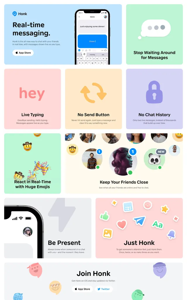
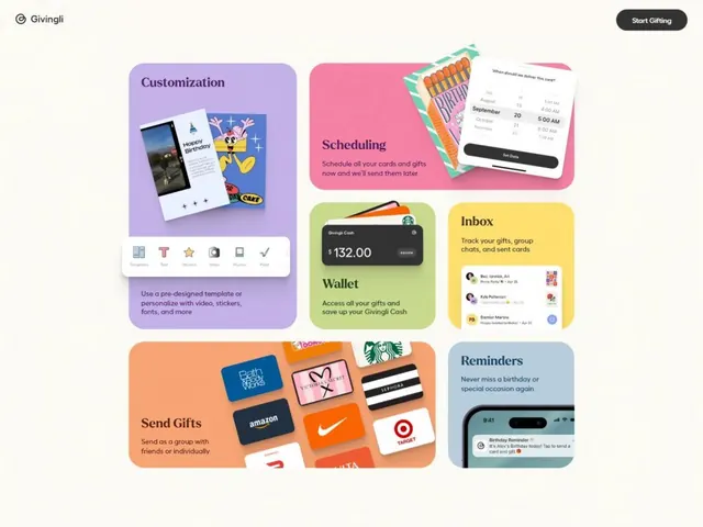
Mobile app marketing page using a playful pastel grid of colorful feature cards to showcase a messaging platform.
Summary
A mobile-first marketing page organized as a vertical stack of colorful pastel cards, each showcasing a distinct app feature with illustration and short descriptive label.
Visual description
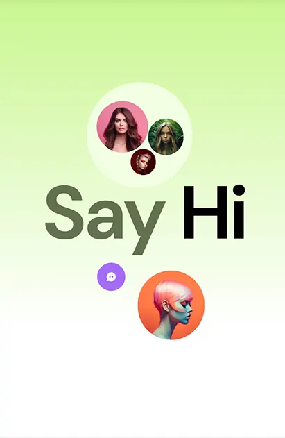
The page uses an asymmetric grid of card modules in soft pastels: pale pink, mint green, soft blue, lavender, peachy orange, and white. Each card contains a feature label and small illustration. Cards include "Real-time messaging" (phone mockup), "Stop Wasting Time on Messages", "hey Live Typing", "No Send Button", "No Chat History", "Keep Your Friends Close" (with emoji), "Be Present" (portrait photo), "Just Honk", and "Join Honk" (CTA). Illustrations are simple line-art or photo-based. Typography is clean sans-serif with prominent labels and smaller body copy. The overall effect is welcoming and youth-oriented.
Key takeaway
The layered pastel system creates visual richness without saturation or noise. Mixing illustration, icons, and photography in the same grid reads as eclectic without feeling chaotic. The card-based vertical scroll suits mobile-first design and product onboarding.
Reuse notes
Excellent reference for consumer app marketing or social product launches. Pastel palette and playful tone work for casual, Gen-Z, or community-driven apps. The modular grid scales well across screen sizes. Avoid for enterprise or serious-tone verticals.
More like this

Keep what you find
A free account saves references to boards and can send you a weekly email of picks based on what you save.
To see every result, go Pro.