Preview image. Unlock full-res
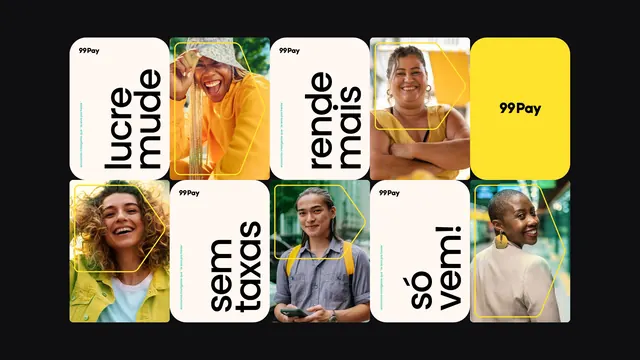
Fintech app identity with a square-card grid mixing lifestyle portraits, bright-yellow solid cards, and typographic cards displaying Portuguese language headings.
Summary
Mobile fintech app interface showing a 3x3 grid of square cards alternating between lifestyle portraits, solid bright-yellow background cards, and cards with Portuguese text labels in black sans-serif.
Visual description
A 3x3 grid of equal-sized square cards fills the composition. Five cards contain cropped lifestyle portraits of smiling people of varied ethnicities and age groups, rendered with warm, golden sunlit tones (yellow clothing, warm backdrops). The 99Pay logo sits in the top-left corner in white. Scattered throughout are white cards with black sans-serif display type reading "lucre mude" (earn change), "rende mais" (yield more), and "so vemi" (just come). One solid bright-yellow card occupies the top-right position. All cards have rounded corners. The background is dark gray to black, isolating the luminous grid above it.
Key takeaway
The color strategy: one bold accent yellow paired with white type cards and warm portrait photography creates cohesion without complexity. The square-card grid format is flexible and app-friendly; it scales responsively. Rounded-corner cards feel contemporary. Portrait selection (diversity, warmth, direct engagement) builds trust for a financial service.
Reuse notes
Ideal for fintech, mobile payments, subscription apps targeting inclusive, friendly positioning. The yellow-white-portrait formula works best when the app emphasizes accessibility and personal connection. Limit supporting colors to avoid visual clutter in a dense grid layout.
More like this



Keep what you find
A free account saves references to boards and can send you a weekly email of picks based on what you save.
To see every result, go Pro.