Preview image. Unlock full-res
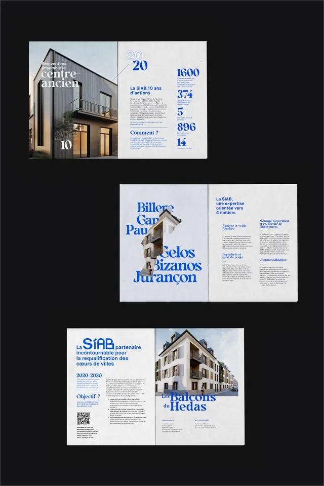
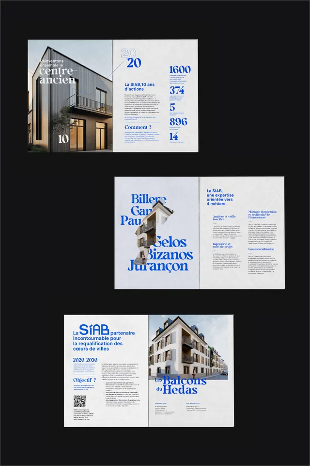
Three-spread architectural brochure layout pairing muted blue type with large photography, employing generous white space and asymmetric grid.
Summary
Three-spread architectural brochure layout pairing muted blue type with large photography, employing generous white space and asymmetric grid.
Visual description
Three folded or separate spreads arranged against a dark background. Top spread: facade photograph of a lit building at dusk on the right, paired with left-aligned blue small-caps headline and subhead in white space. Middle spread: interior shots of luxury hotel lobby and wine bottles, with left-justified blue type and white borders framing the images. Bottom spread: exterior architectural facade photo filling the right side with left-aligned blue heading and subhead. Throughout: strict use of negative space, blue accents in typography only (no colored bars or shapes), generous margins, and a tight grid holding image and text in asymmetric balance.
Key takeaway
The discipline of type color reduced to a single accent (muted blue) against monochrome. Large photography given breathing room via ample white space rather than competing graphic elements. Asymmetric but rigorous grid structure keeps luxury and clarity in balance.
Reuse notes
Strong for architectural, real-estate, hotel, or editorial work targeting premium audiences. Works best with high-quality photography that needs room to breathe. The muted blue keeps the feel sophisticated without color noise. Pair with substantial line-heights and generous gutters.
More like this



Keep what you find
A free account saves references to boards and can send you a weekly email of picks based on what you save.
To see every result, go Pro.