Preview image. Unlock full-res
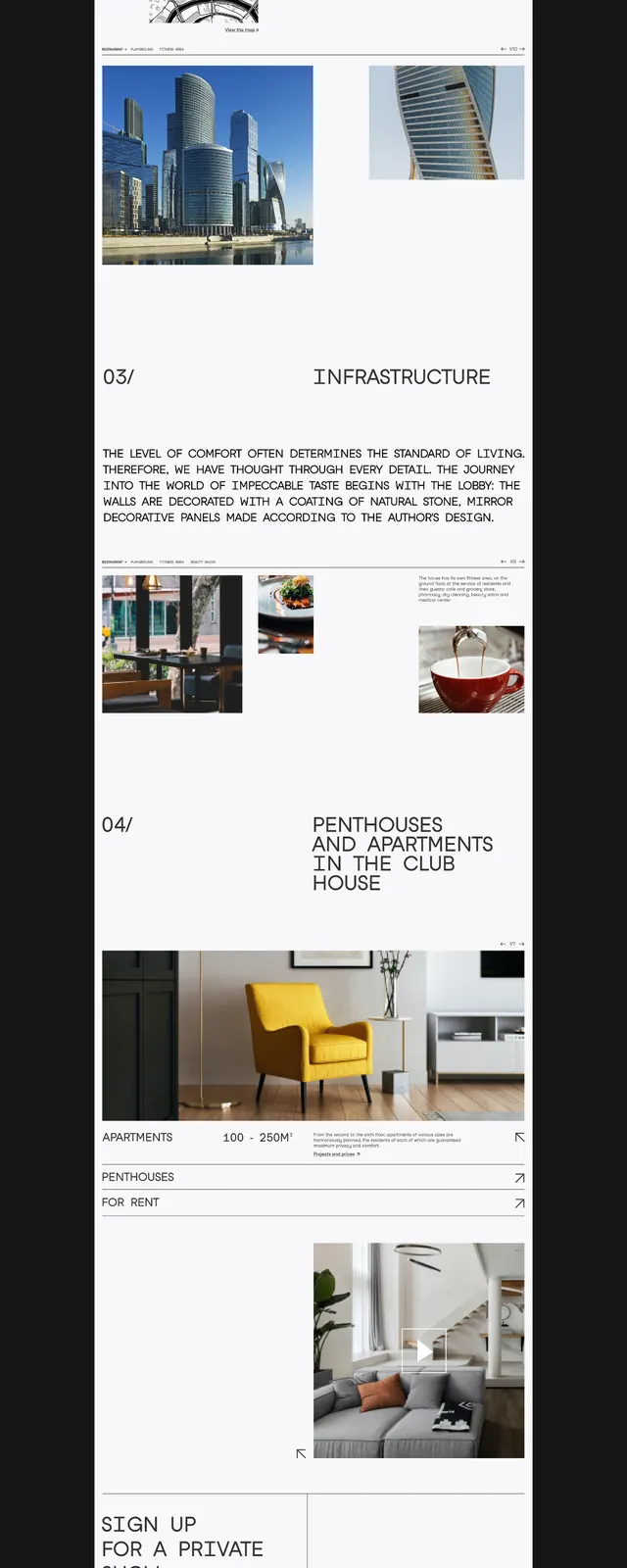
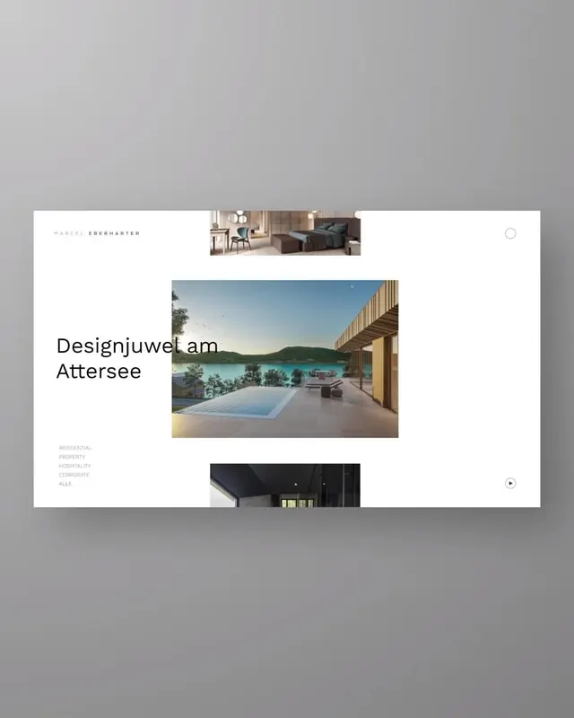
Minimalist dark-on-light website layout with strict grid, sans-serif type, and large photographic imagery of buildings.
Summary
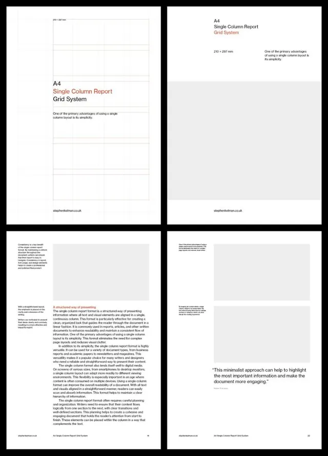
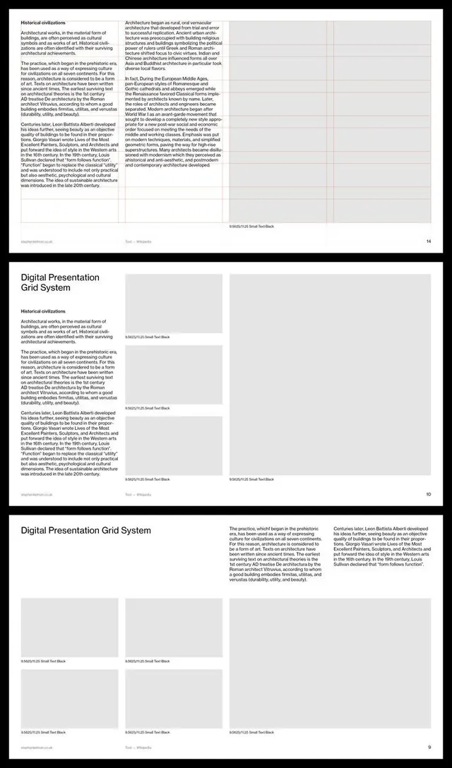
Multi-column portfolio grid mixing text blocks and architectural photography on a white background, using gray accents and tight negative space to emphasize visual discipline.
Visual description
A long-scrolling website layout rendered vertically. White background with charcoal text and structural gray dividers. The grid uses asymmetric columns: wider image blocks featuring large-format architectural photography (building exteriors and interiors), interspersed with narrower text blocks and numerals ("5M", "7", "90") serving as section markers. Helvetica-style sans-serif in various weights (bold heads, regular body). Subtle borders and color chips (pale tan, light blue) provide restrained accent. Ample whitespace between sections. The portfolio showcases design studio or architecture firm work through a spare, gridded presentation.
Key takeaway
Asymmetric column grids that pair photograph and number or text; the disciplined use of one neutral color family with single-hue accents; large-scale imagery as primary navigation cue rather than small thumbnails.
Reuse notes
Ideal for design, architecture, or photography portfolios targeting corporate clients. The cool gray palette suits professional services. Works well for B2B or agency sites; the grid framework scales to both desktop and mobile without heavy decoration.
More like this
Keep what you find
A free account saves references to boards and can send you a weekly email of picks based on what you save.
To see every result, go Pro.