Preview image. Unlock full-res
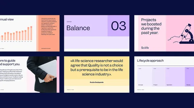
Dark navy dashboard layout with modular panels in lavender, cream, magenta, and orange, organizing charts, quoted insights, and lifecycle diagrams into a structured grid.
Summary
Dark navy dashboard organizing data insights and lifecycle stages into a modular grid of color-blocked panels in lavender, cream, magenta, and orange.
Visual description
A 3x2 grid layout anchored on a dark navy background. Each module contains a distinct data element: a bar chart in gradient orange on cream; a tall orange card with quoted text and small body copy; a lavender card labeled "Balance 03" with an illustrated figure in a playful pose and scale reference; a large dark navy block with white sans-serif body text; a bright yellow card with an italicized quote and attribution; and a pale lavender timeline or stages diagram with horizontal rules. All typography is clean, modern sans-serif in high contrast (white on dark, dark on light). Spacing and padding are consistent throughout, creating a highly organized, "dashboard-ready" feel.
Key takeaway
The disciplined modular grid that makes complex data digestible. The color blocking as functional grouping, not decoration: each color signals a different content type (chart, quote, navigation header, timeline). The yellow accent card in particular offers a flexible container for testimonial or insight callouts.
Reuse notes
Ideal for dashboards, analytics platforms, research reports, or any interface presenting mixed content types (charts, text, stages, diagrams). The color palette reads as scientific or biotech-forward but works equally well for fintech or B2B SaaS. Works best when you have genuine data or structured insight to fill each module.
More like this



Keep what you find
A free account saves references to boards and can send you a weekly email of picks based on what you save.
To see every result, go Pro.