Preview image. Unlock full-res
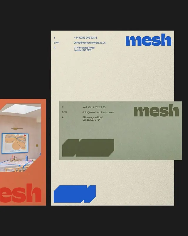
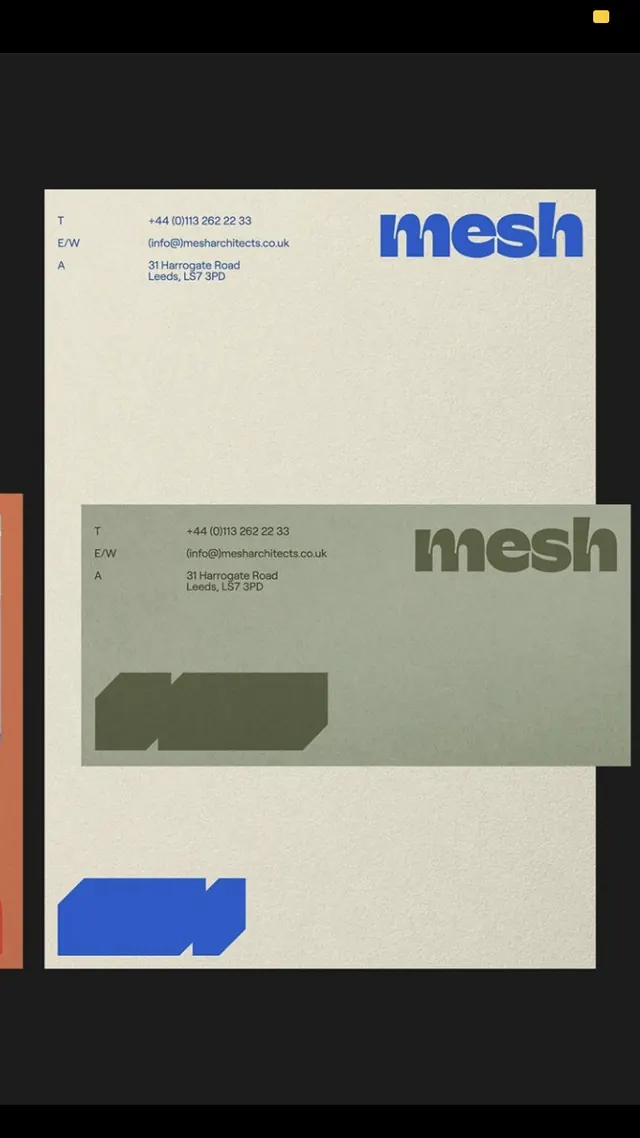
A minimalist architecture firm brand identity presenting letterhead and business cards across cream and sage backgrounds with blue and green geometric shape accents.
Summary
A B2B architecture firm brand uses two soft, neutral-toned letterhead templates paired with colored geometric shape accents, grounding the identity in spatial thinking while maintaining professional restraint.
Visual description
The composition shows the Mesh Architects brand across multiple collateral pieces arranged on a dark background. A cream-colored letterhead displays the "mesh" logotype in bright blue sans-serif (top-right), contact information in dark gray sans-serif (phone, email, address) on the left, and a large green geometric shape (a truncated chevron or arrow form) positioned in the lower half. A sage-green letterhead below mirrors the layout with the "mesh" logotype in muted dark green, matching contact info, and a darker green geometric silhouette. A partial view on the left shows an interior photograph of a minimal office or studio space in warm tones, framed in a bright terracotta-orange border with red text ("esh" visible), providing contextual brand usage. The overall color palette relies on the interaction between warm-toned paper stocks and cool blue-green geometric accents.
Key takeaway
Using the same geometric shape across two colorway variations of stationery establishes a modular, scalable brand system. Pairing high-saturation color accents (blue, green) on neutral, warm paper stocks creates sophisticated contrast without requiring a complex palette. The off-center geometric placement suggests spatial confidence appropriate to an architecture practice.
Reuse notes
Strong template for professional services (architecture, consulting, design) where minimalist restraint paired with geometric systems signals expertise. The warm paper stocks keep the identity approachable despite the cool accent colors. Best when the geometric accent is reproduced consistently across letterhead, cards, and environmental contexts.
More like this

Keep what you find
A free account saves references to boards and can send you a weekly email of picks based on what you save.
To see every result, go Pro.