Preview image. Unlock full-res
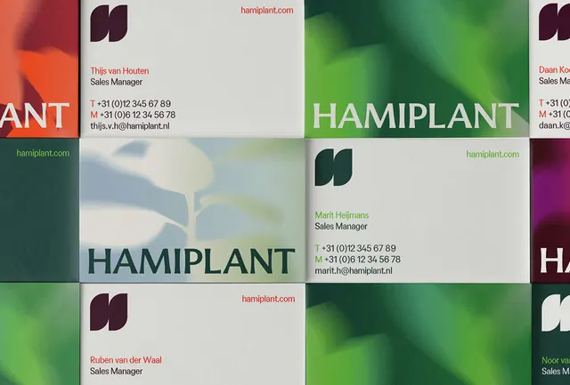
A gridded portfolio of business cards or collateral pieces organized by color family, featuring consistent dark-green typography and natural plant imagery.
Summary
A gridded portfolio of business cards or collateral pieces organized by color family, featuring consistent dark-green typography and natural plant imagery.
Visual description
A multi-card grid layout (approximately 3x3) displaying collateral pieces in muted earth tones. Each card or sleeve features "HAMIPLANT" brand wordmark in black serif type at the top, paired with a cream or light-green background and a vibrant plant photograph (full-color foliage shots). The cards are separated by white negative space and organized into a repeating pattern. Some cards show variations in background hue (greens, creams, soft grays), creating a color study while maintaining a cohesive visual system. Typography is restrained: brand name and small body text in sans-serif. The overall effect is editorial and modular, designed for consistent application across a brand identity suite.
Key takeaway
The color-block grid approach demonstrates how to organize multiple collateral items into a cohesive story without redundant content. Pairing minimal sans-serif type with one photographic element per card creates breathing room and lets the photography carry visual weight. The grid itself becomes a design element, reinforcing the systematic nature of the brand.
Reuse notes
Effective for portfolio presentations, brand guidelines, or marketing materials targeting design-conscious B2B audiences. The grid works well in digital (web, PDF) and print. Consider using when you need to present multiple applications of a single brand system at once, or when photography is a core differentiator. The muted earth-tone palette is versatile and reads as sophisticated and trustworthy.
More like this




Keep what you find
A free account saves references to boards and can send you a weekly email of picks based on what you save.
To see every result, go Pro.