Preview image. Unlock full-res
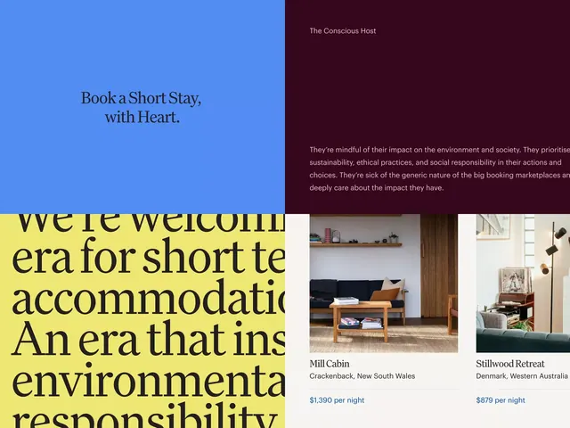
Web layout showing a luxury vacation rental platform with a split composition: blue side features tagline text, burgundy side displays branding and sustainability messaging, with property previews below.
Summary
A vacation rental site landing page split vertically between a calming blue side with serif headline and a burgundy side with brand values, transitioning to lifestyle property photography and pricing tiers below.
Visual description
Top half splits 50/50 left and right. Left side is bright blue with serif display type in dark teal: "Book a Short Stay, with Heart." Right side is deep burgundy containing the site name "The Conscious Host" in small sans-serif at top, followed by justified gray body copy explaining the brand's environmental and ethical focus (sustainability, ethical practices, social responsibility). The bottom half shows a yellow-background text block (left side) with serif type describing "a new era for short term accommodation" and environmental responsibility, alongside two lifestyle property photography cards with clean borders: "Mill Cabin" in Crackenback, NSW ($1,390/night) and "Stillwood Retreat" in Denmark, Western Australia ($879/night). Each property card includes small overhead/lifestyle image, location label, and per-night pricing in blue type.
Key takeaway
The vertical split uses contrasting colors (cool blue, warm burgundy) to separate the emotional pitch (left) from brand values (right), working on wide screens without feeling cramped. The serif/sans-serif pairing (serif for headline, sans for body) adds sophistication. Lifestyle photography + price transparency builds trust; the sustainability copy differentiates in a crowded vacation rental market.
Reuse notes
Perfect for luxury/conscious-consumer platforms (travel, wellness, sustainable goods). The two-tone split hero scales well to desktop and reflows to stacked on mobile. The property-card grid below the fold encourages scrolling. Best paired with a product-focused visual hierarchy (photos larger than price). Strong for brands emphasizing ethics or environmental impact.
More like this

Keep what you find
A free account saves references to boards and can send you a weekly email of picks based on what you save.
To see every result, go Pro.