Preview image. Unlock full-res
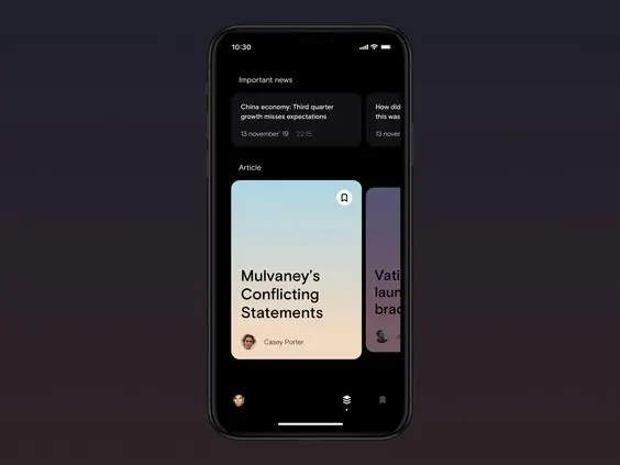
A dark-mode mobile interface mockup for a news app featuring a card-based feed layout with article previews, avatars, and minimal tab navigation.
Summary
A dark mobile app interface mockup displaying a scrollable news feed with stacked card components, each showing article headlines, author avatars, and publication metadata in a content-first hierarchy.
Visual description
A smartphone frame displays a vertical news feed against a very dark charcoal-navy background. Near the top, two small text blocks labeled "Important news" list headlines with dates. Below, a large card with a light blue-grey background contains a white serif headline ("Mulvaney's Conflicting Statements") paired with a small circular author avatar showing initials or a profile image. To the right is a partial purple card showing cropped headline text. The bottom bar shows three navigation icons in minimal style. The overall color scheme relies on high contrast between the dark background and light content cards, with muted accent greys and purples providing subtle visual separation between sections.
Key takeaway
The card-based architecture that separates content chunks without heavy borders or shadows, relying on background color shifts instead. The clear information hierarchy that leads with the headline and author, making scanning fast even in a dark theme. Using a single light accent color (the soft blue-grey card) to draw focus on the featured article while secondary content recedes into monochromatic grey text.
Reuse notes
Ideal for news aggregators, content feeds, article libraries, and any app where users scan multiple items quickly. The dark theme reduces eye strain for extended reading sessions and pairs well with high-contrast text-heavy content. The card-and-gap structure adapts well to varying content types (video preview, quote, sponsored) without redesign. Less suitable for products requiring heavy visual imagery or color-coded categories.