Preview image. Unlock full-res
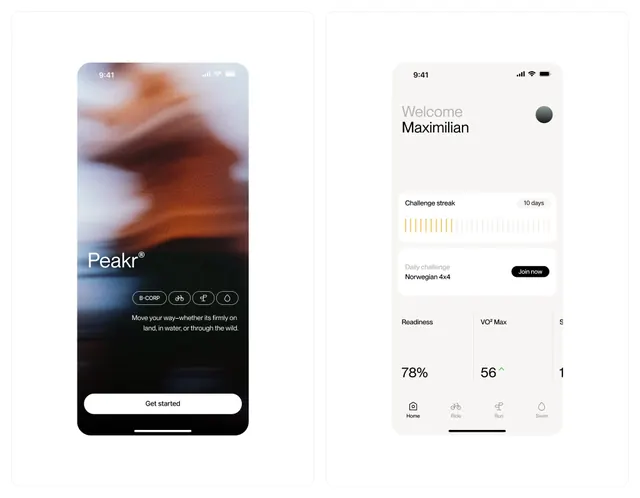
Two mobile fitness app screens with contrasting visual treatments: a blurred photographic hero on the left, a clean data-focused layout on the right.
Summary
A two-screen fitness-app moodboard showing a blurred action photo hero with a "Get started" CTA and a clean data dashboard with stats, streak indicator, and bottom navigation.
Visual description
Left screen: a blurred outdoor sports photograph (mountain climbing or hiking) overlaid with the Peakr wordmark in white, three icon buttons (B-COMP, altitude, compass, rings), a descriptive tagline "Move your way whether its firmly on land, in water, or through the wild," and a prominent white pill button. Right screen: a light background dashboard with "Welcome Maximilian" greeting, a dark user avatar, a challenge streak tracker showing progress bars in bright orange/yellow, a "Join now" call-to-action button, and three key metrics (Readiness 78%, VO2 Max 56, score 1) displayed in large type with a four-tab navigation at the bottom (Home, Ride, Run, Swim).
Key takeaway
The dual-screen contrast technique: photographic, motivational entry point paired with clean, stats-driven operational interface. The use of warm accent color (orange/gold) to highlight progress and action items. Icon-based navigation and metric cards that organize quantified fitness data without visual clutter.
Reuse notes
Strong reference for health and fitness apps seeking to balance inspirational onboarding against data-dense dashboards. Works well for apps targeting athletes or performance-conscious users. The warm accent color pairs naturally with skin tones and outdoor photography.
More like this


Keep what you find
A free account saves references to boards and can send you a weekly email of picks based on what you save.
To see every result, go Pro.