Preview image. Unlock full-res
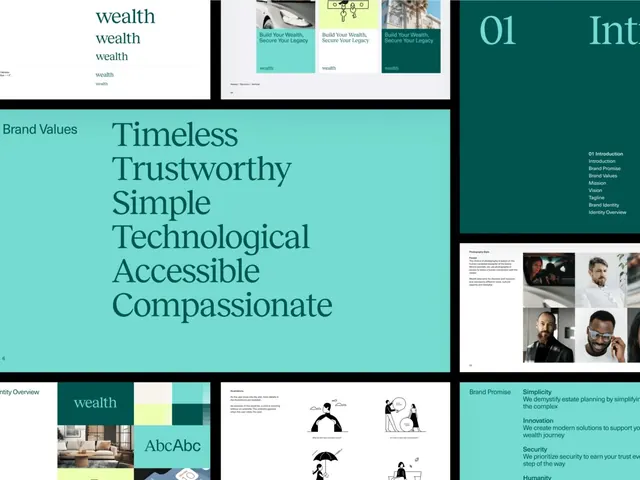
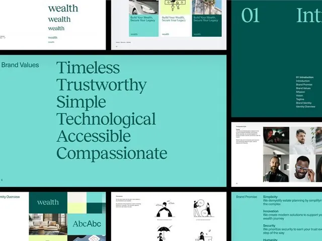
A comprehensive brand identity system for a wealth-management fintech using a teal color palette, serif typography, and values-driven messaging (Timeless, Trustworthy, Simple, Technological, Accessible, Compassionate).
Summary
A multi-page brand guideline for a wealth-management fintech, showing a structured identity system built on a teal and white palette, serif and sans-serif typefaces, and six brand value pillars with supporting illustration and photography systems.
Visual description
The image contains six pages spanning the brand system: the cover shows "wealth" repeated at different scales in teal text; a product interface page displays three mobile app mockups with turquoise and white card designs; a brand-values section features a large serif display headline ("Timeless Trustworthy Simple Technological Accessible Compassionate") in teal on a light turquoise background, anchored by a color swatch grid below showing the teal, white, and navy palette plus a serif typeface specimen ("AbcAbc"); a navigation section outlines the guideline structure; a photography-style page showcases a 2x2 grid of male and female portraits in various indoor settings; and a final section illustrates how brand values translate to illustrated icons and explanatory copy. The layout is modular and grid-based throughout, with consistent white space, left-aligned type, and the teal color anchoring every page.
Key takeaway
The brand-values section is exceptionally clear: six single words displayed at large scale with explanatory copy create memorable messaging that guides every design decision. The color palette (teal/white/navy) creates high contrast and legibility while reading as modern and trustworthy. The grid-based layout with consistent margins keeps the guideline visual and scannable.
Reuse notes
A strong reference for fintech, financial services, or B2B tech identity systems. The serif typeface paired with sans-serif gives sophistication without coldness. Works particularly well for wealth-management positioning (the teal reads premium yet approachable). The illustrated icon system for brand values is worth studying for any service-business brand.
More like this





Keep what you find
A free account saves references to boards and can send you a weekly email of picks based on what you save.
To see every result, go Pro.