Preview image. Unlock full-res
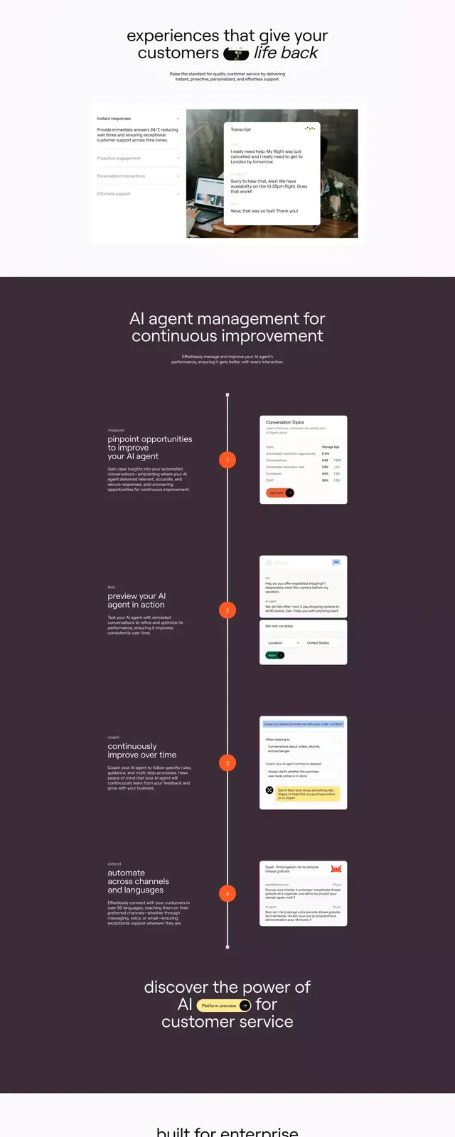
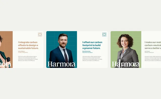
A multi-section design system layout showing logo treatments, color palette (deep teal, burnt orange, cream, muted brown), typography guidelines, and brand application mockups in a structured modular grid.
Summary
A comprehensive brand identity guidelines document laid out as a modular grid, displaying logo lockups, a restricted color palette, typeface specimens, and real-world application examples for a B2B consulting or technology firm.
Visual description
The layout is organized into discrete rectangular sections stacked and arranged on a light cream background. At the top, the brand logo appears in multiple configurations (horizontal, lockup variations). Below, a color palette swatch panel displays five core colors: deep forest teal, burnt-sienna orange, warm cream, muted taupe-brown, and soft gray-blue. Typography sections show sans-serif font families and weights used across the system. Lower sections present application mockups (business cards, packaging, digital interfaces) rendered in the brand colors, demonstrating how the system works in context. Each section is clearly delineated with white space and subtle dividing lines. The overall composition follows a consistent grid, creating a sense of order and strategic brand planning.
Key takeaway
The modular card-based layout that breaks down a complex identity system into digestible, scannable pieces. The restrained palette of earthy, sophisticated colors (teal-orange-cream) that feels both professional and distinctive. The use of real mockups rather than color swatches alone to show how the system applies to actual products and touchpoints.
Reuse notes
Essential reference for designing a cohesive brand identity system, particularly for B2B, consulting, or technology brands. The deep teal and burnt-orange combination is versatile and works across print, digital, and environmental contexts. The modular layout works well as a PDF guideline document or a single-page visual reference. Note the palette's muted tones; ensure sufficient contrast against body text if used as background colors.
More like this





Keep what you find
A free account saves references to boards and can send you a weekly email of picks based on what you save.
To see every result, go Pro.