Preview image. Unlock full-res
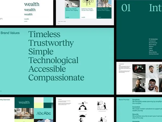
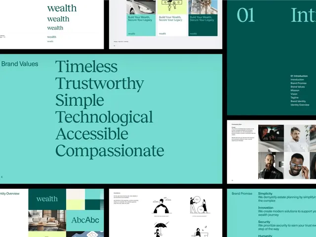
Multi-panel brand guidelines spread pairing a teal/mint color palette and typography system with six brand values stacked vertically: timeless, trustworthy, simple, technological, accessible, compassionate.
Summary
A systematic brand-values guide for a wealth-management firm, pairing a teal-and-white color system with six stacked values in a modular, grid-based layout.
Visual description
White background divided into distinct sections with a thick black divider on the left. The upper section shows the brand name "wealth" repeated at scale, anchored to repeated teal word marks. A large mid-section panel displays six vertically stacked values in a sans-serif display face: Timeless, Trustworthy, Simple, Technological, Accessible, Compassionate. To the right, a deep teal panel shows supporting imagery including brand applications and product cards. Below, the lower half showcases color swatches (pale mint, cream, teal, dark teal), a typography specimen, and illustration treatments including simple line-drawn figures and abstract shapes. Generous white space separates all modules, creating visual breathing room.
Key takeaway
The discipline of stacking a verbal brand promise (six words, one per line) at large scale as the design system's centerpiece. The systematic split between color/type specimen (grid view) and applied usage (real mockups and photography) on a single page. The use of a single bold divider to separate thematic zones.
Reuse notes
Strong template for any wealth, fintech, or professional-services brand toolkit. The color-first approach and emphasis on verbal clarity works well when brand personality depends on trust and stability. The modular grid is easy to extend with additional elements.
More like this





Keep what you find
A free account saves references to boards and can send you a weekly email of picks based on what you save.
To see every result, go Pro.