Preview image. Unlock full-res
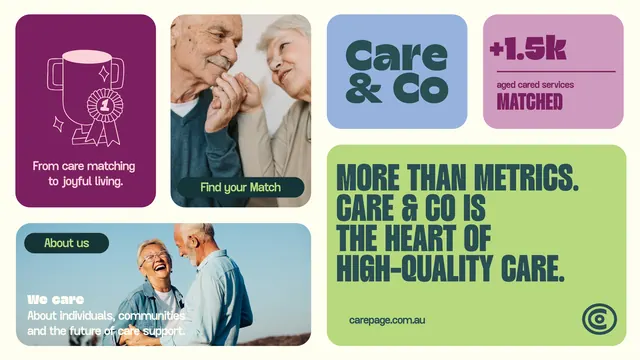
Modular grid of healthcare brand cards using bold typography, warm photography, and vibrant color blocks to convey trust and compassion.
Summary
Care & Co brand system using a grid layout with color-blocked cards, soft photography, and display sans-serif to establish trustworthiness in senior care services.
Visual description
A six-card grid on a light background. Top row: deep magenta rounded rectangle with white line icon and caption (care-matching theme); full-width color photo of two people (senior care); soft blue-gray rounded rectangle with headline "care & Co"; mauve rounded rectangle with tagline "aged care services" and "MATCHED" badge. Center: large lime-green card with bold all-caps headline ("MORE THAN METRICS. CARE & CO IS THE HEART OF HIGH-QUALITY CARE.") in teal. Bottom: light teal card with "About us" button and color photo of two smiling people, with caption text overlay. The color palette ranges from deep jewel tones to soft pastels to bright lime, creating visual variety while maintaining cohesion through sans-serif typography and rounded corners throughout.
Key takeaway
Use a grid of heterogeneous card sizes and colors to break up a bland layout while keeping each card's content scannable and distinct. Pair warm color photography with solid color blocks and bold type for visual interest. The modular approach allows reuse of individual components across marketing touchpoints.
Reuse notes
Strong for healthcare, insurance, and senior-care marketing where you need to convey both professional authority and human warmth. Works well when the brand has a multi-faceted value proposition (matching, care, trust) that benefits from visual separation. The bright accent color (lime) works as a focal point against neutrals; ensure photos are genuinely warm-toned to match the palette intent.
More like this









Keep what you find
A free account saves references to boards and can send you a weekly email of picks based on what you save.
To see every result, go Pro.