Preview image. Unlock full-res
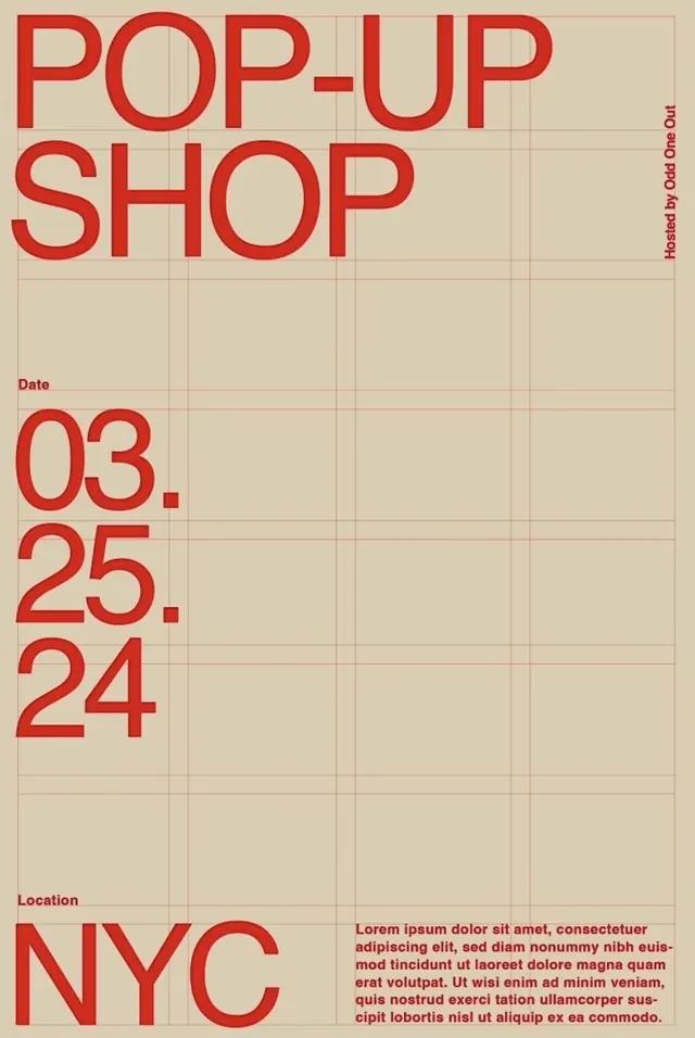
Minimalist event poster using bold red sans-serif typography stacked vertically on a pale beige field overlaid with a thin grid, communicating event details with utilitarian directness.
Summary
Minimalist event poster using bold red sans-serif typography stacked vertically on a pale beige field overlaid with a thin grid, communicating event details with utilitarian directness.
Visual description
A pale, warm beige background is divided by an orthogonal grid of fine tan lines, creating a modular composition field. In the upper left, "POP-UP SHOP" is set in oversized red sans-serif capitals, each word stacked vertically and left-aligned, commanding visual dominance. Below, a small "Date" label introduces the dates "03.25.24" in bold red numerals, aligned left. Further down, "Location" introduces "NYC" in the same bold red, all-caps display face. A vertical red text block on the right edge reads "Hosted by Odd One Out." At the bottom, a full-width justified block of smaller red body text (placeholder) provides event description or terms. The overall effect is direct, grid-based, and reminiscent of mid-century Swiss design or contemporary minimalist event graphics, emphasizing information hierarchy through size, color, and modular spacing rather than ornament.
Key takeaway
The use of a subtle grid background that organizes the entire composition without dominating it. Bold, large-scale sans-serif display type in a single accent color (red) set against a neutral background creates immediate visual contrast and hierarchy. The left-aligned, stacked arrangement of headline elements gives the poster a contemporary retro feel that reads as authoritative and clear. The modular spacing that respects the grid creates rhythm and readability without clutter.
Reuse notes
Perfect for event promotion, product launches, or gallery openings where a calm, organized aesthetic suits the brand voice. The beige-and-red palette evokes warmth and urgency without aggression. The grid background can be tightened or loosened depending on the design system; even faint, it grounds the typography. Best used when the event details are straightforward and fit neatly into the modular structure. The utilitarian tone works well for design-forward or creative-industry audiences but may feel cold for consumer goods without softer imagery or additional color.
More like this

Keep what you find
A free account saves references to boards and can send you a weekly email of picks based on what you save.
To see every result, go Pro.