Preview image. Unlock full-res
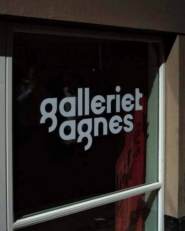
Pale serif type on a dark gallery window creates austere institutional presence through pure contrast and minimalist composition.
Summary
Pale serif type on a dark gallery window creates austere institutional presence through pure contrast and minimalist composition.
Visual description
A gallery window at night displays stacked serif letterforms spelling "galeriet agnes" in pale off-white against a black interior pane. The typeface is wide, lowercase, and proportional, framed by a white window mullion that bisects the composition horizontally. To the right, faint color streaks (likely artwork or fabric inside) signal activity within. The brutality of the contrast and deadpan framing convey museum-grade restraint.
Key takeaway
The power of pure light-on-dark typographic reversal on actual material (glass, not screen). Using an existing architectural feature (the window frame) as your design grid, letting negative space within the letterforms breathe against the black void.
Reuse notes
Reserve for institutional, gallery, or high-minded design work. The pale serif matters; modern sans would feel too corporate. Works best when the display surface (glass, metal, stone) reads as real material, not graphic art.
More like this




Keep what you find
A free account saves references to boards and can send you a weekly email of picks based on what you save.
To see every result, go Pro.