Preview image. Unlock full-res
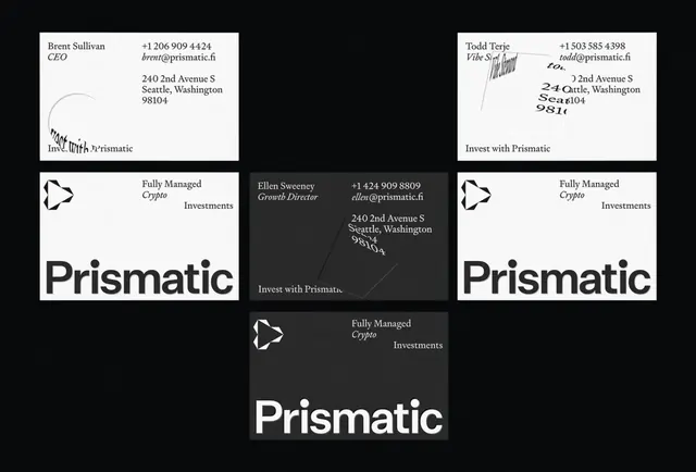
A set of minimalist business cards for a cryptocurrency investment firm, alternating between white, dark gray, and black backgrounds with geometric logo and serif typography.
Summary
A business card system for Prismatic (a fully managed crypto investments firm) featuring alternating white, dark, and light gray cards with a geometric play-button logo and a mix of serif and sans-serif type.
Visual description
The grid shows five business cards arranged on a black background. Each card alternates between white, dark gray, and light gray card stocks. All cards show the same geometric logo (a right-pointing play-button shape) and the company name "Prismatic" in large sans-serif display type (lowercase). Each card carries different contact information, titles (CEO, Vibe Setter, Growth Director), phone numbers, email addresses, and addresses for Seattle, Washington. Serif type appears in address and title lines, while the company name is sans-serif. The layout is clean and left-aligned on each card, with generous margins. Black, gray, and white are the only colors used.
Key takeaway
The alternating background colors add visual interest without introducing a secondary color palette, maximizing contrast for printing economy. The geometric logo is simple enough to work at multiple sizes and in single-color printing. The title/role typography mixing serif and sans keeps hierarchy clear without visual noise.
Reuse notes
Strong reference for fintech or crypto branding. The high-contrast approach suits premium finance positioning. Works well for other professional services (consulting, legal, accounting). The card format scales the concept to other touchpoints (letterhead, envelope, folder inserts). Print this system on uncoated stock to emphasize the minimalist aesthetic.
More like this




Keep what you find
A free account saves references to boards and can send you a weekly email of picks based on what you save.
To see every result, go Pro.