Preview image. Unlock full-res
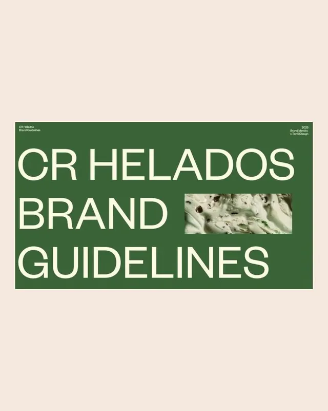
Brand guidelines cover page for CR Helados with bold white sans-serif headline on deep green, small photography cutout, and minimal layout.
Summary
A brand guidelines cover page for CR Helados, an ice-cream brand, featuring oversized white sans-serif type on a deep forest-green horizontal band with a small photographic detail cutout and cream background.
Visual description
Cream background with a deep forest-green horizontal rectangle extending full width across the middle. Within the green: large white sans-serif letters spelling "CR HELADOS BRAND GUIDELINES" (stacked three lines, tight tracking), a small rectangular photograph of textured ice-cream detail at mid-right, and small text callouts in cream ("Brand Identifier", "Brand Manual") at top corners. Institutional color scheme. Minimal elements, clean geometric composition, emphasizing type as primary visual.
Key takeaway
The restraint of using one bold color block, white type, and one subtle photography cutout to signal sophistication and product category. The horizontal band anchors hierarchy without decoration. Works for any food or consumer-facing brand identity system.
Reuse notes
Ideal for brand guideline documents, institutional reports, or food-industry branding. The green-cream duotone reads warm and approachable without being playful. Scale the type large and trust the color contrast. Adapts well to PDF covers, print standards, and on-screen presentations where trustworthiness and clarity matter.
More like this







Keep what you find
A free account saves references to boards and can send you a weekly email of picks based on what you save.
To see every result, go Pro.