Preview image. Unlock full-res
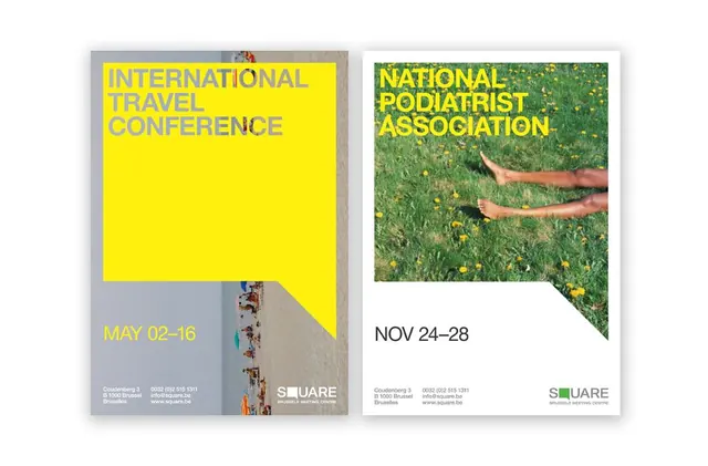
Two event posters using bold yellow backgrounds, naturalistic photography, and sans-serif headers to advertise an International Travel Conference and National Podiatrist Association meeting.
Summary
Two event posters using high-contrast bright yellow blocks paired with photographic imagery and sans-serif typography to advertise professional conferences with strong compositional clarity.
Visual description
Two side-by-side vertical posters, each using a split composition strategy. Left poster: large yellow rectangle on a gray/beige background with all-caps white serif-styled text reading "INTERNATIONAL TRAVEL CONFERENCE" and event date "MAY 02-16" in yellow, topped by a small architectural photograph showing an aerial view of people on steps. Right poster: beige background with a naturalistic photograph of bare feet on green grass with yellow wildflowers, topped by green all-caps sans-serif text reading "NATIONAL PODIATRIST ASSOCIATION" and date "NOV 24-28". Both feature the institutional logo and contact information (SQUARE, Brussels) in small type at the base.
Key takeaway
The yellow vs. green color flip creates visual variety while maintaining institutional consistency; the photographic crop showing only the relevant body part (feet, building) reinforces the subject; the date range presented separately from the title maintains scanability.
Reuse notes
Effective for professional and institutional event promotion, especially healthcare and travel sectors. The yellow-on-gray strategy commands attention without aggression. Works when you need to convey credibility and professional standards alongside human/natural imagery.
More like this








Keep what you find
A free account saves references to boards and can send you a weekly email of picks based on what you save.
To see every result, go Pro.