Preview image. Unlock full-res
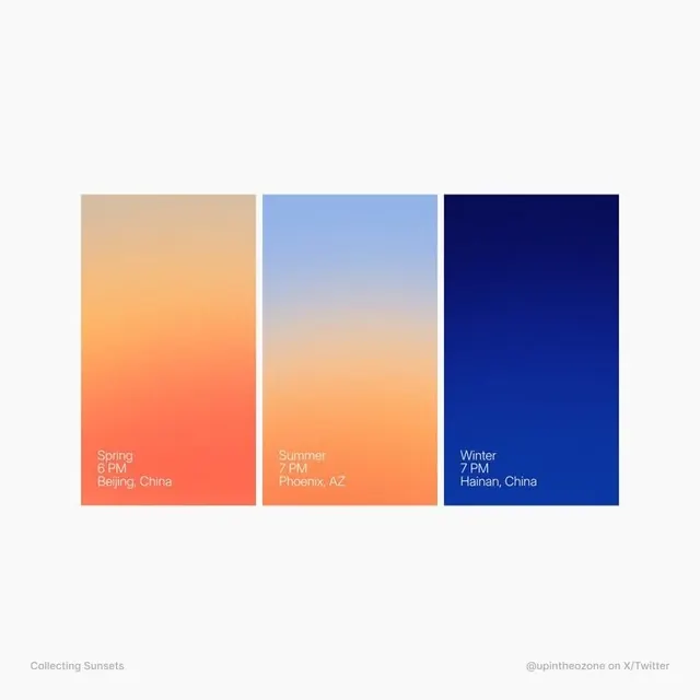
A three-panel card set showcasing seasonal color transitions from warm orange through light sky-blue to deep navy, each labeled with a season, time, and destination.
Summary
Three vertical gradient panels representing spring, summer, and winter, each transitioning from a warm or cool dominant color to its opposite, with location and time labels anchoring the bottom of each card.
Visual description
Three equal-width vertical panels arranged side-by-side on a light off-white background. Left panel: warm peach fading to coral-orange at bottom, labeled "Spring 6 PM, Beijing, China" in white sans-serif. Middle panel: pale sky-blue at top gradually warming to peachy-orange at bottom, transitioning through the seasonal warmth, labeled "Summer 7 PM, Phoenix, AZ". Right panel: deep navy blue at top fading to lighter cream tones at bottom, labeled "Winter 7 PM, Hainan, China". Each label sits in the gradient's lower third. A small credit "Collecting Sunsets / @upintheozone" appears at the bottom corners. The overall effect is serene and meditative, using color to convey seasonal mood.
Key takeaway
The three-panel gradient-transition structure efficiently conveys seasonal variation in color temperature and light. The bottom-aligned labels ground each card and add narrative (location and time). The palette choice is distinctive: contrasting warm (spring-summer) against cool (winter) without harsh transitions creates visual sophistication. This card pattern is reusable for any set of three states or timelines that benefit from gradient expression.
Reuse notes
Strong reference for travel content, seasonal storytelling, or time-based narratives that benefit from color-psychology cues. Works well as a component in mood boards, blog headers, or app interface sections. The attribution is clearly marked as a design study/illustration by upintheozone, so respect copyright if reusing the specific concept. The color-blocking approach translates well to digital interfaces, print materials, or branded social content where seasonal or temporal shifts need visual language.
More like this



Keep what you find
A free account saves references to boards and can send you a weekly email of picks based on what you save.
To see every result, go Pro.