Preview image. Unlock full-res
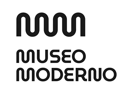
Bold wavy mark above stacked sans-serif logotype spelling MUSEO MODERNO, high-contrast black on white.
Summary
Museo Moderno brand identity showing a wavy-line geometric mark above the institution name set in a bold, wide sans-serif, centered on white.
Visual description
Centered composition on a plain white background. A simple wavy mark made of four flowing curves sits at the top, black, occupying about one-third of the height. Below it, the text MUSEO MODERNO is set in large, geometric sans-serif with generous letter-spacing. The typeface is bold, lowercase with even weight throughout. No ornament, color variation, or texture. The overall rhythm is calm and balanced, with the flowing wavy mark introducing a slight sense of movement against the geometric rigidity of the type.
Key takeaway
The pairing of a smooth, organic wavy mark with rigid geometric sans-serif creates visual interest without decoration. The relationship is hierarchical: mark draws the eye, then anchors the text below. Clean monochrome execution means this system works at any scale and across all media. The generous letter-spacing in the logotype adds sophistication and breathing room.
Reuse notes
Ideal for cultural institutions, museums, galleries, nonprofits, or sophisticated B2B brands. The high contrast and simple mark translate well to environments needing strong signage or digital presence. Test the wavy mark at small sizes to ensure it remains legible. Works especially well in monochrome, but the mark could be subtly tinted or reversed out on colored backgrounds if needed.
More like this
Keep what you find
A free account saves references to boards and can send you a weekly email of picks based on what you save.
To see every result, go Pro.