Preview image. Unlock full-res
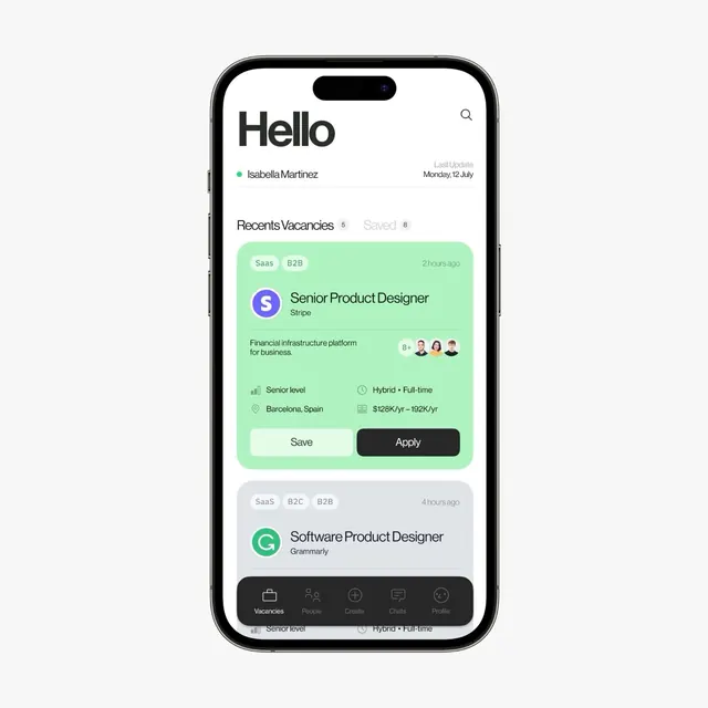
Mobile job listing app with mint-green highlighted cards, combining product photography, role metadata, and bottom navigation on a light background.
Summary
A mobile recruitment app screen displaying a personalized job feed with two expandable cards: one mint-green featured listing for Stripe (Senior Product Designer), one muted-gray card below for Grammarly (Software Product Designer).
Visual description
iPhone mockup with light off-white background. Header reads "Hello" in bold sans-serif with user name "Isabella Martinez" and "Last Update: Monday, 12 July" inline. Below, "Recents Vacancies" tab is active (5 listings shown), "Saved" tab grayed (8 items). First card: mint-green background, rounded corners, brand logo (S in purple circle, Stripe wordmark), job title in semi-bold black, brief description of platform type, small avatar row showing 8+ applicants, metadata row (Senior level, Hybrid + Full-time) and salary range (128K-192K/yr), two action buttons (Save as white rounded outline, Apply as dark solid). Second card partially visible below with similar structure, teal logo (G circle, Grammarly). Bottom navigation bar in dark gray/charcoal (Vacancies, People, Create, Chats, Profile).
Key takeaway
The contrast between the featured mint card and muted background forces focus on the primary action. Stacking metadata in a tight row (role level, work mode, salary) without overwhelming the card. Avatar cluster with count (8+) shows social proof without repeating individual names.
Reuse notes
Strong pattern for B2B hiring platforms, freelance marketplaces, and internal talent mobility tools. The mint accent works well on light backgrounds for high-contrast CTAs. Adapts to both web and mobile; could flatten to a list view on desktop.
More like this



Keep what you find
A free account saves references to boards and can send you a weekly email of picks based on what you save.
To see every result, go Pro.