Preview image. Unlock full-res
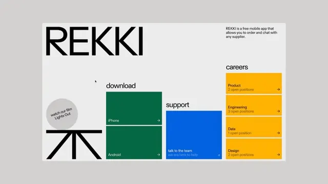
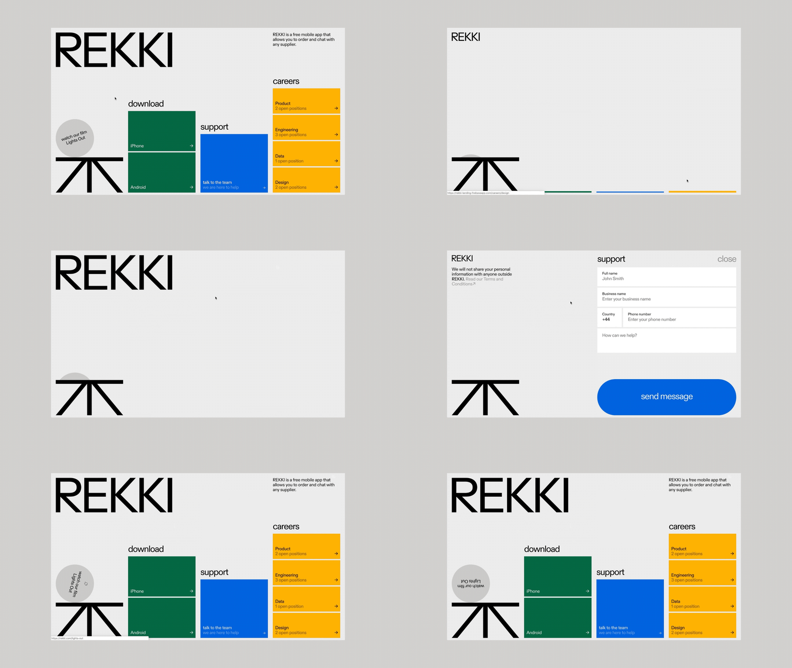
Product-focused app marketing graphic with minimal layout grid showing REKKI logo, download links for iOS and Android, support section in blue, and careers opportunities in golden yellow.
Summary
REKKI mobile app marketing graphic using a minimal grid layout with forest green and bright gold sections organizing download links, support contact, and careers opportunities.
Visual description
A pale gray background hosts a structured four-quadrant layout in off-white. The top-left features the REKKI logotype in bold black sans-serif. Below, a circular badge with text "mobile app live on iOS & App Out" (descriptor partially visible). The left-center contains a dark forest green section labeled "download" with iOS and Android options, each with a right-pointing arrow. Center-right shows a primary electric-blue panel for "support" with "talk to the team" text. The right side displays three stacked bright golden-yellow panels for "careers" organized by role (Product, Engineering, Data, Design), each with position count and arrow. The entire system uses clean sans-serif typography in varying weights and sizes, emphasizing clear information hierarchy.
Key takeaway
The color-blocking strategy (distinct color per function) enables rapid visual scanning; the grid subdivision cleanly separates concerns (download/support/careers) without additional dividers; the consistent right-facing arrows provide micro-interaction cues that guide the eye.
Reuse notes
Effective for SaaS and consumer app onboarding, download prompts, and recruitment landing pages. The modular grid scales easily to additional sections. Works at medium display sizes on web and print. The high contrast supports accessibility and readability across devices.
More like this




Keep what you find
A free account saves references to boards and can send you a weekly email of picks based on what you save.
To see every result, go Pro.