Preview image. Unlock full-res
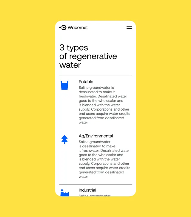
Bright yellow information card with white interior listing three water types using blue icons and body copy.
Summary
An information-rich card UI with bright yellow background, white rounded panel interior, featuring a Wacomet logo, headline, and three icon-led content categories describing water types and processing methods.
Visual description
High-contrast bright yellow full-bleed background holds a white rounded-rectangle card panel dominating the center. Inside, the Wacomet logo with menu hamburger sits top-right. A black headline "3 types of regenerative water" aligns left, followed by three horizontal sections separated by thin gray lines. Each section pairs a blue geometric icon (cup, tree, factory shapes) with a category label (Potable, Ag/Environmental, Industrial) and multi-line body copy in gray sans-serif. Icons use solid blue fill, creating strong visual anchors. The composition is vertically stacked, legible, and data-organized.
Key takeaway
The contrast pairing of bold background color with a white content panel. Icon-plus-label-plus-copy organization for explaining grouped categories. The subtle border separators creating structure without visual heaviness. Geometric icon treatment that remains legible at small sizes.
Reuse notes
Effective pattern for SaaS onboarding, product comparisons, or educational content. The yellow background is eye-catching and works for tech/water/sustainability brands. Icon set is simple enough to maintain visual consistency across many categories. Legible on mobile with its vertical stacking. Pair with professional body copy when explaining processes or product tiers.
More like this







Keep what you find
A free account saves references to boards and can send you a weekly email of picks based on what you save.
To see every result, go Pro.