Preview image. Unlock full-res
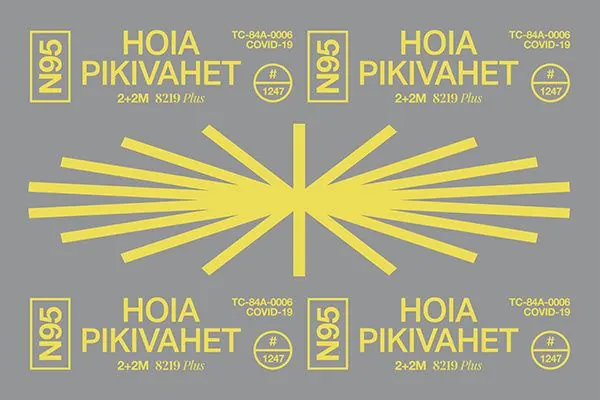
Symmetrical institutional design system with bright yellow radiating sunburst and four-corner badge composition on gray, featuring all-caps sans-serif type.
Summary
A grid-based institutional identity system centered on a bright yellow sunburst radiating from the center, with badge marks and all-caps type repeated in four symmetrical corners on a neutral gray field.
Visual description
Central composition with bright yellow rays emanating from a central point in a starburst pattern, creating dynamic motion from a static focal point. Four mirrored quadrants place outlined badge marks containing "No.25" and text reading "HOIA PIKIVAHET" paired with reference codes and Covid-related date stamps. All typography rendered in all-caps bright yellow sans-serif on gray background, creating high contrast. The symmetrical layout conveys order and official authority, consistent with government or public-health institutional design systems of mid-20th-century modernism.
Key takeaway
The sunburst as a radial focal point that adds visual energy while maintaining rigid symmetry. The four-corner badge placement that anchors a composition without needing other elements. The constraint of two colors (yellow and gray) creating bold, legible institutional graphics. The grid system implied by symmetrical placement.
Reuse notes
Strong template for government, public health, or institutional identity systems requiring authority and clarity. The yellow-gray palette reads as both modern and historical. Works well for official documentation, signage, or system marks. Less suited for commercial or playful contexts. Modernist aesthetic appeals to design-forward nonprofits and B2B brands positioning on heritage or institutional trust.
More like this




Keep what you find
A free account saves references to boards and can send you a weekly email of picks based on what you save.
To see every result, go Pro.