Preview image. Unlock full-res
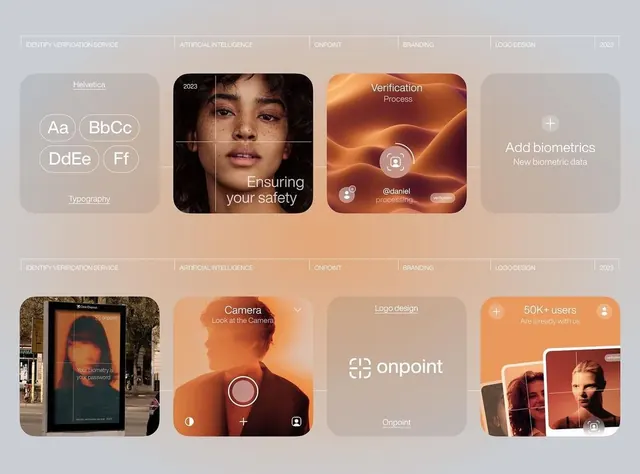
Dashboard of app screens and brand components for a biometric verification service, showing card-based UI layouts over a warm gradient palette.
Summary
Dashboard of app screens and brand components for a biometric verification service, showing card-based UI layouts over a warm gradient palette.
Visual description
A two-row grid of six card modules presenting the Onpoint biometric verification app. Top row: typography sample card (Helvetica, serif/sans-serif mix), face-recognition camera interface (portrait photo with crosshair grid overlay, white label "Ensuring your safety"), and biometric processing screen (orange radial gradient background, @daniel username, processing toast, fingerprint icon). Bottom row: street photography mockup (phone mounted on building), camera interface with circular focus ring (orange gradient background, navigation controls), logo design plate (Onpoint wordmark in white), and user metrics card (50K+ users stat, multicolored photo thumbnails). All cards use rounded corners and are arranged symmetrically. Warm beige/tan header and footer bars contain service labels (Identify Verification Service, AI, Onpoint, Branding, Logo Design, 2023).
Key takeaway
The composition of showing a product alongside its design system components (typography, colors, usage); the warm-to-terracotta gradient as a design-system unifier across disparate UI states; card-based modular layout for presenting multiple screen states and design decisions in a single overview.
Reuse notes
Effective for fintech or security product case studies, or brand/design system showcases. The card-based grid works well for portfolios presenting multiple app states. The warm gradient palette suggests security/trust without coldness. Caution: this is a design mockup for presentation, not production code.
More like this




Keep what you find
A free account saves references to boards and can send you a weekly email of picks based on what you save.
To see every result, go Pro.