Preview image. Unlock full-res
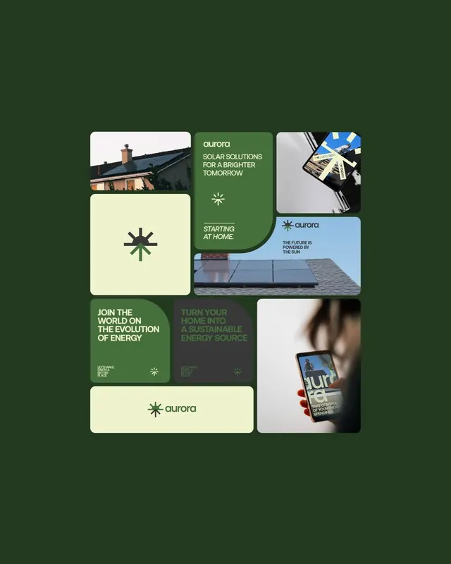
Modular grid layout for Aurora solar company featuring green, cream, and dark-gray cards with imagery, typography, and icon symbols against a dark-green background.
Summary
Modular grid layout for Aurora solar company featuring green, cream, and dark-gray cards with imagery, typography, and icon symbols against a dark-green background.
Visual description
An asymmetric bento-grid layout on a dark-forest-green background displays nine rectangular cards in varying sizes. Cards alternate between deep forest green, light cream, charcoal gray, and off-white, each containing either photography (solar panel close-up, rooftop installation, phone mockup), typography ("SOLAR SOLUTIONS FOR A BRIGHTER TOMORROW", "STARTING AT HOME", "JOIN THE WORLD ON THE EVOLUTION OF ENERGY"), or a simple white icon (four-pointed sun symbol). The Aurora logo appears twice in the layout. Rounded corners on all cards and consistent padding create a contemporary, approachable feel while maintaining strict alignment to an underlying grid.
Key takeaway
The asymmetric bento-grid system for balancing image and text; the earth-tone and green palette for communicating sustainability authentically; the four-pointed sun icon as a simple, recognizable brand mark; the use of photography and typography in alternating cards to create rhythm without decoration.
Reuse notes
Effective template for B2B energy or sustainability brands. The modular approach scales well for website sections, pitch decks, or print collateral. Works best with high-quality photography that conveys real-world application. The palette maps naturally to eco-friendly messaging but can be adapted to other categories using the same grid principle.
More like this





Keep what you find
A free account saves references to boards and can send you a weekly email of picks based on what you save.
To see every result, go Pro.