Preview image. Unlock full-res
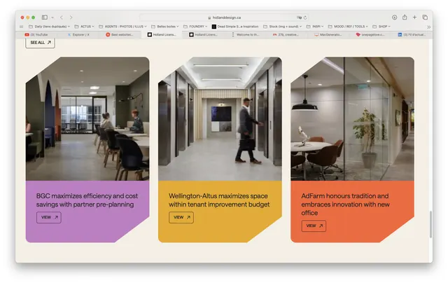
Three-column grid of interior space photography with colored accent panels below each image labeling service offerings.
Summary
A three-column grid layout presenting interior design services through high-quality photography paired with colored accent cards containing descriptive text labels.
Visual description
Three full-color interior photographs arranged left to right, each showing a different commercial space (open floor plan with seating, corridor with doorways, desk workspace). Below each photograph sits a solid-colored rectangular accent panel containing service descriptions in black sans-serif type. The accent colors progress from muted purple-blue (left), golden-yellow (center), to coral-orange (right), creating a warm but controlled color progression. Typography is clean and minimal, with varied text sizes establishing hierarchy within each panel.
Key takeaway
The color-accent strategy: muted, warm panels provide both visual breaks and functional labels without overwhelming the photographic content. The grid creates immediate visual balance and comparative reading. Service cards sit flush beneath photos, creating a tight card unit that reads as a single composed element.
Reuse notes
Strong for interior design, real-estate, or commercial-services marketing. Works well when photography quality is high and the space itself is the hero. The colored panels should complement, not compete with, the images; tone and saturation matter. Adapts to multi-column (2-4 columns) depending on available width and number of services.
More like this



Keep what you find
A free account saves references to boards and can send you a weekly email of picks based on what you save.
To see every result, go Pro.