Preview image. Unlock full-res
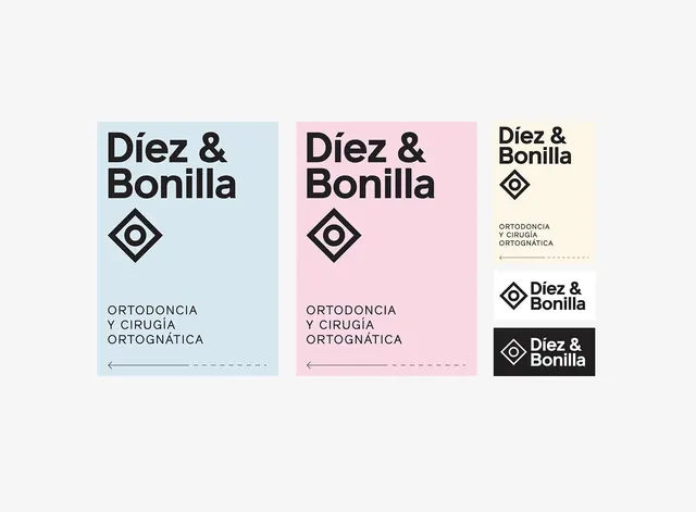
A visual identity system for an orthodontics clinic featuring a geometric logo, distinct color blocking, and clean typography.
Summary
A visual identity system for an orthodontics clinic featuring a geometric logo, distinct color blocking, and clean typography.
Visual description
The design showcases a logo featuring a stylized diamond shape with a central cross, paired with the brand name 'Diez & Bonilla'. It presents three variations: a blue block, a pink block, and a vertical stack with a black block, all using a clean sans-serif font.
Key takeaway
The identity uses strong geometric shapes and high-contrast color blocks to establish a professional and modern medical brand.
Reuse notes
The modular color-blocking and geometric icon can be adapted for various clinic signage and stationery.
More like this


Keep what you find
A free account saves references to boards and can send you a weekly email of picks based on what you save.
To see every result, go Pro.