Preview image. Unlock full-res
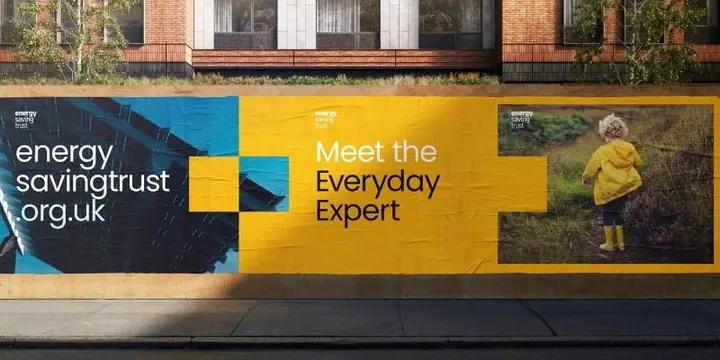
UK public-service billboard for Energy Saving Trust using asymmetric color blocks (blue-yellow-natural) to present a branded URL alongside a feature on everyday energy experts.
Summary
UK public-service billboard for Energy Saving Trust using asymmetric color blocks (blue-yellow-natural) to present a branded URL alongside a feature on everyday energy experts.
Visual description
A three-section billboard layout anchored by a large yellow block spanning the right two-thirds. The left third pairs deep teal with white text stating the organization's URL "energysavingtrust.org.uk" in a condensed sans-serif. The center yellow section holds white sans-serif headline "Meet the" with black display text "Everyday Expert" below. The right third shows a full-height portrait of a person in a yellow jacket against green landscape, bleeding to the photograph's edge. Thin white grid lines divide the sections. The brick building visible above anchors the billboard to its urban context.
Key takeaway
The asymmetric color blocking creates distinct visual zones without losing compositional unity. The scale contrast (URL text vs. large headline vs. lifestyle photography) establishes clear hierarchy. Pairing corporate yellow branding with relatable human portraiture softens institutional messaging.
Reuse notes
Works well for public-service or nonprofit campaigns needing to balance organizational identity with human approachability. The unequal section divisions add dynamic tension while the limited color palette (two accent colors plus neutrals) keeps complexity low. Suits billboard and large-format applications where distant legibility matters.
More like this



Keep what you find
A free account saves references to boards and can send you a weekly email of picks based on what you save.
To see every result, go Pro.