Preview image. Unlock full-res
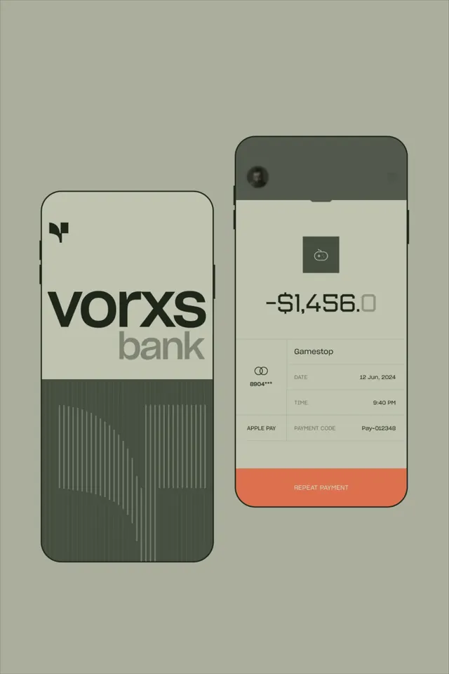
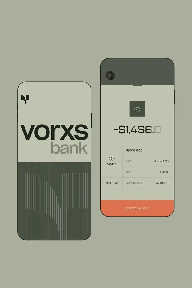
Dual-phone mockup showing Vorxs Bank card and transaction receipt interface with muted neutral palette, minimal typography, and waveform pattern detail.
Summary
A side-by-side mobile banking interface showing a card face with waveform pattern and a transaction receipt screen with orange action button, united by neutral grays and sans-serif typography.
Visual description
Two phone mockups displayed against a light beige background. The left phone shows the Vorxs Bank card face: a charcoal rounded-rectangle area with a centered brand logotype and a subtle vertical waveform line pattern running up the lower half. The right phone displays a transaction details screen with a dark camera notch at the top, muted neutral background, centered transaction icon in a gray square, a large negative transaction amount in dark sans-serif type, merchant name (Gamestop), date and time fields, Apple Pay badge, and a full-width rounded coral/orange action button labeled "REPEAT PAYMENT" at the bottom. All type is right-aligned or center-set in a clean sans-serif family.
Key takeaway
The reductive approach to financial data display: negative amounts prominently centered, metadata (date, time, payment code) set in a narrow right-aligned column, clear visual separation between read-only info and actionable elements. The waveform pattern as a subtle secondary visual that signals fintech without noise. The coral accent color as sole departure from the muted palette, drawing focus to the action.
Reuse notes
Ideal for fintech product design, banking apps, or payment flows where trust and clarity are paramount. The narrow information density works well on mobile viewports. The orange accent pattern scales to other action states (confirm, cancel, repeat). Palette works across light and dark modes if adjusted.
More like this




Keep what you find
A free account saves references to boards and can send you a weekly email of picks based on what you save.
To see every result, go Pro.