Preview image. Unlock full-res
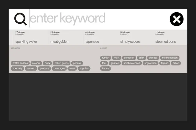
A dark-mode search interface with search bar, categorized pill tags (cuisines and ingredient types), and timestamped search history in a monochromatic layout.
Summary
A dark-mode search interface for a food-discovery platform featuring a central search bar, organized category pills (ingredients, cuisines), and timestamped search history below.
Visual description
White search bar at the top with magnifying-glass icon left and close icon (X) right, set against a dark background. Below: a two-row grid of gray pill-shaped tags organized under "categories" (left: coffee, alcohol, dairy, baked goods, general, specialty, seafood, produce, beverages, meat, supplies) and "popular" (right: turkish, meat, european, asian, chinese, mediterranean, thai, german, south american, argentinian, filipino, italian, french). Each pill has rounded corners and medium-light gray fill. Above the tags sit five search items with times ("27min ago in London", "20min ago in London", etc.) and dish names ("sparkling water", "meat golden", "tapenade", "simply sauces", "steamed buns") in the same sans-serif font. The entire composition uses only shades of gray, white, and dark charcoal with no accent color.
Key takeaway
The dual-tier tag system: recent searches at top, categorical quick-filters below. The consistent use of rounded-corner pills as an affordance for clickable categories. The restraint in color; the design reads as both efficient and approachable without relying on bright accent colors. The timestamp + location labels give personality while staying minimal.
Reuse notes
Strong pattern for any discovery interface (recipe, product, service). Works well for dark-mode designs, especially in food, retail, or marketplace contexts. The pill-tag system scales well if you add or remove categories; pair this with robust search logic to handle the input.
More like this

Keep what you find
A free account saves references to boards and can send you a weekly email of picks based on what you save.
To see every result, go Pro.