Preview image. Unlock full-res
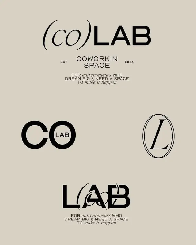
Branding toolkit for a coworking space showing four logo treatments (stacked logotype, paired initials, oval monogram, geometric composition) and supporting text hierarchy on cream background.
Summary
A minimal logo system for a coworking space showing four typographic variations (horizontal lockup, paired circles, serif monogram, geometric composition) alongside supporting tagline and italicized tagline on a warm cream field.
Visual description
Warm cream background with black text and geometric shapes. Top: "(CO)LAB" in italic serif and bold sans-serif, flanked by "EST" and "2024" in small caps, with "COWORKING SPACE" below and an italicized tagline underneath. Middle: two logo marks, a bold double-circle with "CO" and "LAB", and a serif "L" enclosed in an oval outline. Bottom: "LAB" with overlapping parentheses and letter forms, again with the tagline repeated. All elements use optical spacing and minimal ornamentation, relying on weight variation and geometric precision for visual hierarchy.
Key takeaway
Four distinct logo treatments from one typographic system. The pairing of serif and sans-serif in the logotype adds sophistication without introducing a second font. The italic tagline creates emphasis through style contrast rather than weight or color.
Reuse notes
Strong reference for tech startups and coworking spaces seeking understated brand identity. The cream background works as a print or digital template. Oval monogram and stacked text are especially useful for small-scale applications like favicons or avatars.
More like this

Keep what you find
A free account saves references to boards and can send you a weekly email of picks based on what you save.
To see every result, go Pro.