Preview image. Unlock full-res
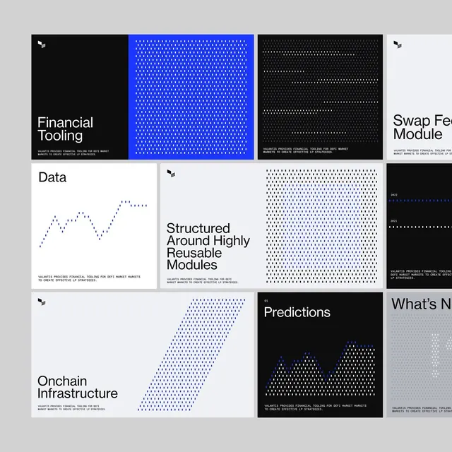
Asymmetric modular system for fintech using electric blue dot patterns, black, white, and minimal sans-serif type to present financial concepts, data charts, and hierarchical labels.
Summary
A fintech brand system layout showing black, white, and light gray panels filled with electric blue dot patterns, line charts, and bold sans-serif labels for financial products and infrastructure concepts.
Visual description
Asymmetric grid on light gray background with 8-12 modular sections. Top-left: solid black panel with white copy "Financial Tooling" and small icon. Top-center: solid electric blue panel completely filled with dense white dot texture. Top-right: black panel with white dot pattern and truncated label. Left-middle: white panel with blue dotted line chart labeled "Data" and small icon. Center: light gray panel with large black sans-serif heading "Structured Around Highly Reusable Modules" and dense black-on-white dot texture filling 50% of space. Bottom-left: white panel with large blue diagonal dot pattern, black text "Onchain Infrastructure", and icon. Bottom-center: black panel with white pyramid chart labeled "Predictions". Right side: light gray sections and partially visible panels. All text rendered in condensed geometric sans-serif, mostly capitals.
Key takeaway
The dot-texture technique unifies diverse content types (charts, type, solid color) into a cohesive visual system. The electric-blue-on-black contrast reads as technologically forward without being garish. Asymmetric balance allows flexibility in module sizes while the consistent 4-8px grid keeps it organized.
Reuse notes
Perfect for fintech, data analytics, trading platforms, or blockchain brands needing technical credibility mixed with approachability. The modular approach allows reuse in decks, web sections, or annual reports. Works best with 5-8 concept areas to fill; fewer panels look sparse, more require deeper nesting.
More like this



Keep what you find
A free account saves references to boards and can send you a weekly email of picks based on what you save.
To see every result, go Pro.