Preview image. Unlock full-res
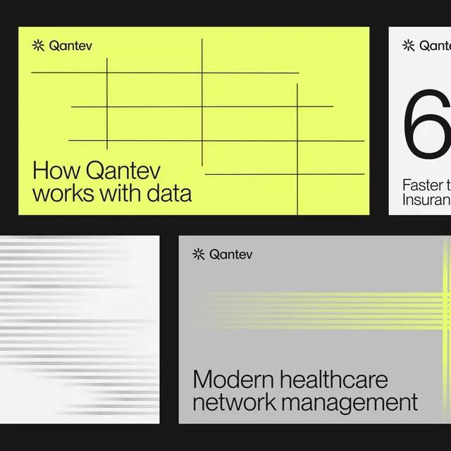
Corporate grid poster for Qantev (data analytics) using neon yellow backgrounds, black grid lines, and modular layouts showcasing healthcare data workflows.
Summary
Corporate grid poster for Qantev (data analytics) using neon yellow backgrounds, black grid lines, and modular layouts showcasing healthcare data workflows.
Visual description
A multi-panel composition with bold neon-yellow primary panel (top-left) featuring black grid lines and the headline "How Qantev works with data". Adjacent panels in light gray and white show chart symbols, numbered data metrics (like "6" and "Faster than Insurance"), and descriptive line diagrams. Heavy black lines create a Swiss grid structure that organizes separate categorical sections. Large bold sans-serif headlines contrast sharply against the yellow. Bottom-right panel displays "Modern healthcare network management" with additional yellow horizontal line accents stacked on a gray background. Black borders separate each section.
Key takeaway
The high-contrast neon-yellow / black / light-gray three-color system creates urgency and clarity. The rigid grid structure with generous black dividing lines organizes complex information cleanly. Oversized bold headlines and data-focused line diagrams communicate technical concepts without illustration.
Reuse notes
Strong reference for healthcare tech, data analytics, or SaaS dashboards that need to communicate system architecture or workflow organization. The bold yellow works best on dark or neutral backgrounds to maintain contrast. Works well paired with minimal iconography or diagrammatic line illustrations.
More like this




Keep what you find
A free account saves references to boards and can send you a weekly email of picks based on what you save.
To see every result, go Pro.