Preview image. Unlock full-res
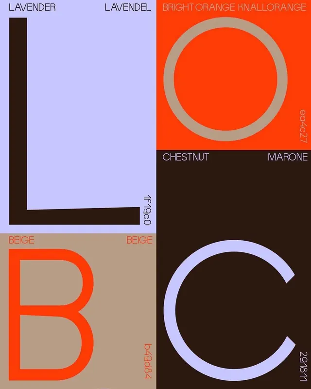
Educational four-quadrant color palette chart displaying named swatches in lavender, bright orange, chestnut, and beige with geometric circles and letters as visual anchors.
Summary
A systematic color palette educational poster divided into four sections, each labeled with color names (Lavender, Bright Orange, Chestnut, Beige) and displaying bold geometric forms (circles, letters B and C) as visual examples of how colors interact and contrast.
Visual description
Four-quadrant composition with a dark brown border frame. Top-left quadrant: light lavender background with dark chestnut brown vertical bar on left edge and label "LAVENDER" at top. Top-right quadrant: vibrant bright orange background with centered gray circle and thin concentric circle outline, plus labels "BRIGHT ORANGE" and "KNALORRANGE" in light text. Bottom-left quadrant: beige background with large red-orange letter B (outlined in darker brown) and labels "BEIGE" repeated. Bottom-right quadrant: dark chestnut background with light lavender incomplete circle outline and label "MARONE" visible. Small version date codes (06/2027, c2978i1) appear on right and bottom edges. Condensed sans-serif typeface in all-caps used consistently for color identification; geometric letter forms serve as color test subjects.
Key takeaway
The paired complementary colors (lavender-orange, chestnut-light) demonstrate color harmony theory viscerally; large geometric shapes (circles, letters) make color interaction obvious and memorable; the systematic labeling treats colors as a named, methodical palette rather than random choices.
Reuse notes
Perfect for design system documentation, color theory teaching materials, or brand palette presentations. The modular quadrant approach scales easily if more colors need to be added. Works exceptionally well in educational or design-focused contexts where explaining color relationships is the goal. Less suitable for interface design or layouts that need more breathing room.
More like this




Keep what you find
A free account saves references to boards and can send you a weekly email of picks based on what you save.
To see every result, go Pro.