Preview image. Unlock full-res
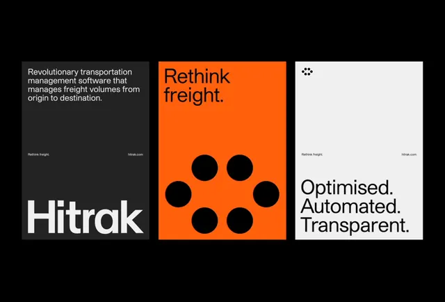
Hitrak logistics brand identity split across three contrasting panels: dark, bold orange, and clean white.
Summary
Three-part brand presentation for Hitrak freight management software combining dark navy, signal orange, and white panels with logotype, abstract circle motif, and value propositions.
Visual description
Horizontal three-panel composition on a black background. Left panel: dark charcoal background with small tagline text ("Revolutionary transportation management software that manages freight volumes from origin to destination") in light gray, white "Hitrak" logotype at bottom. Center panel: bright orange background with six black circles arranged in a loose circular pattern. Right panel: white background with stacked sans-serif text reading "Optimised. Automated. Transparent." with small logo icon above and "Rethink freight." tagline. All panels equal width. Each corner carries the Hitrak branding mark or URL reference.
Key takeaway
The orange as a visual accent that breaks the neutral palette instantly. The six-circle motif is abstract but systematic, suggesting network or connection. The three-panel modular approach lets a single visual identity flex across taglines, icon systems, and core messaging without repetition.
Reuse notes
Strong for B2B logistics, supply chain, or SaaS brands that need to project both boldness and professionalism. The high contrast between panels makes it work at any scale. Works best when the orange is the dominant color in digital or print layouts, not buried.
More like this



Keep what you find
A free account saves references to boards and can send you a weekly email of picks based on what you save.
To see every result, go Pro.