Preview image. Unlock full-res
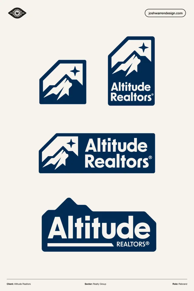
Logo system for Altitude Realtors: mountain-and-peak geometric icon with multiple lockup variations on cream and navy, designed for real estate branding.
Summary
Altitude Realtors logo system shown as four lockup variations: badge icons only, stacked icon-and-wordmark badges, horizontal lockup with text, and mountainscape wordmark in dark navy sans-serif on cream.
Visual description
Logo system displayed vertically with designer credit (joshwarrendesign.com) and client info (Altitude Realtors, Real Estate, Rebrand) at bottom. Four distinct treatments: (1) small geometric icon (peaked mountain shape with star, framed in rounded-square badge); (2) same icon scaled larger beside stacked wordmark; (3) icon in horizontal-rectangle badge with "Altitude Realtors" in bold sans-serif; (4) typographic lockup with "Altitude" in bold condensed sans-serif, "REALTORS" in smaller caps, and an underline detail. All marks use consistent navy (#012B53) on cream background. Every variation shares the same mountain peak and star motif, creating a cohesive identity system.
Key takeaway
Icon-first branding strategy (the mountain badge stands alone at 1:1); a single primary geometric mark (peak + star) that works scaled from icon to hero; the discipline of showing 3-4 locked variants (no freestyle). Navy-and-cream palette is refined and memorable for real estate without being cliche.
Reuse notes
Best for B2B/professional services where consistent mark recognition across digital and print is critical (business cards, letterhead, signage, digital apps). The mountain peak is specific to geography/altitude messaging but the structural approach (icon, stacked, horizontal, type-only) is a template. Designed for versatility rather than decoration.
More like this





Keep what you find
A free account saves references to boards and can send you a weekly email of picks based on what you save.
To see every result, go Pro.