Preview image. Unlock full-res
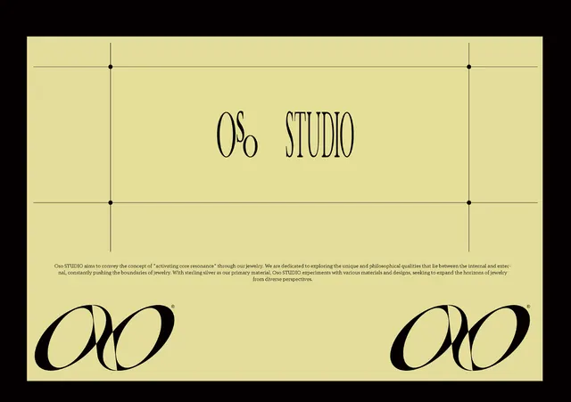
Minimalist luxury brand specimen for 'OO STUDIO' with oversized serif display type against a cream background, anchored by precise geometric grid lines and black ornamental forms.
Summary
Minimalist luxury brand specimen for 'OO STUDIO' with oversized serif display type against a cream background, anchored by precise geometric grid lines and black ornamental forms.
Visual description
Center-aligned composition on pale cream background (almost butter yellow). At the top, a three-line geometric grid in thin black lines with equidistant corner marks. Below that, "OS STUDIO" in a modern serif or transitional typeface sized very large, elegantly spaced with proper letterspacing. A body-text paragraph in small dark gray serif describes the studio's philosophy about "activating core resonance" through jewelry and material exploration. The lower half features two identical large black ornamental monograms or letterforms (stylized "OO") symmetrically placed left and right, adding visual weight. Thin vertical lines extend from the grid marking through the composition, creating a modular, Swiss-influenced structure.
Key takeaway
The grid-as-structural-anchor approach that ties typography and imagery together without needing borders or boxes. The restrained color palette (cream, black, pale tan) applied with confidence across different type scales and weights. The use of abstract letterforms as decorative elements that reinforce the brand without literal illustration.
Reuse notes
Perfect reference for luxury goods, high-end design studios, or jewelry branding. The grid system provides an excellent scalable foundation for applications and marketing collateral. The approach works best when there is genuine negative space available, so avoid cramping this pattern into small containers. Pairs well with minimal photography or product shots placed within the grid structure.
More like this



Keep what you find
A free account saves references to boards and can send you a weekly email of picks based on what you save.
To see every result, go Pro.