Preview image. Unlock full-res
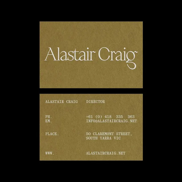
Minimalist business card featuring centered serif typography in white on a warm kraft-brown field, with monospaced contact details and elegant negative space.
Summary
A two-sided business card for director "Alastair Craig" using centered serif typography in white against a warm kraft-brown field, accented by monospaced contact details.
Visual description
A kraft-brown field fills the composition, divided into two horizontal sections. The upper section contains a large, elegant white serif name in display weight centered on a subtle texture. The lower section is anchored by centered uppercase sans-serif text reading "ALASTAIR CRAIG" and "DIRECTOR" in white, followed by monospaced contact information: phone, email, street address, and website. All text aligns center, creating a classical formality. The warm brown tone and minimal ornament convey established, understated professionalism.
Key takeaway
The pairing of a large, classical serif name with tiny monospaced contact details creates visual rhythm and hierarchy without added decoration. The centered composition on a solid warm ground feels intentional and timeless. The restraint to two weights and monospaced details keeps the card readable at small scale while maintaining elegance.
Reuse notes
Ideal for professional-services firms, law, management consulting, or luxury goods where understated sophistication signals authority. The kraft-brown works well in print and photographs well for digital promotion. The extreme minimalism requires good typography and generous spacing to avoid feeling sparse.
More like this








Keep what you find
A free account saves references to boards and can send you a weekly email of picks based on what you save.
To see every result, go Pro.