Preview image. Unlock full-res
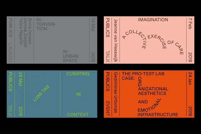
Four-panel exhibition poster grid for a publications series, with each panel assigned a saturated color and minimal serif-less typography rotated vertically on the spine.
Summary
Four-panel exhibition poster grid for a publications series, with each panel assigned a saturated color and minimal serif-less typography rotated vertically on the spine.
Visual description
Four rectangular panels arranged in a 2x2 grid, each occupying equal space on a black background. Top left: pale gray panel with vertical spine text and theme "IN-TERVENTION"; top right: pale pink/salmon panel with "IMAGINATION" and rotated spine labels; bottom left: teal-blue panel with yellow-green text reading "CURATING IN LUMI TAN CONTEXT"; bottom right: orange panel with black serif display type spelling "THE PRO-TEST LAB CASE" and "ORGANIZATIONAL AESTHETICS AND EMOTIONAL INFRASTRUCTURE". Each panel's theme is set vertically along the left edge in small sans-serif type, with additional text rotated orthogonally. The grid shares a consistent color-blocking vocabulary with minimal image content, relying entirely on typography and hue for differentiation.
Key takeaway
The four-corner color-blocking system creates instant visual hierarchy without imagery. The vertical spine labels become a unifying design pattern across panels. Rotating text along multiple axes reinforces the type-specimen nature and adds graphic dynamism to a static grid.
Reuse notes
Works well for exhibition catalogs, publication collections, or typographic series where four or more discrete projects or essays need equal prominence. The dense information architecture suits academic or cultural institutions. Avoid when images or photography need space; this is type-first.
More like this

Keep what you find
A free account saves references to boards and can send you a weekly email of picks based on what you save.
To see every result, go Pro.