Preview image. Unlock full-res
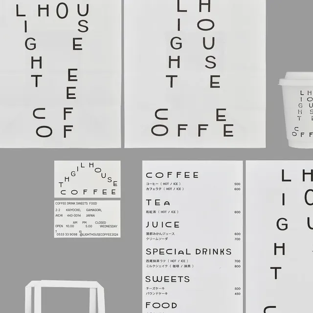
Japanese cafe branding system using geometric letterform scattering and high-contrast monochrome to create playful sophistication in a minimal footprint.
Summary
A cafe identity system that treats individual letters as graphic elements, spacing them geometrically across signage, menus, and collateral to create a modern, restrained visual language.
Visual description
Modular identity system shown across collateral: large billboard/poster with letters of "LIGHTHOUSE COFFEE" scattered across a light-gray background in a deliberately disorienting geometric grid; menu board with "COFFEE," "TEA," "JUICE," "SPECIAL DRINKS," "SWEETS," "FOOD" in ranked display type alongside Japanese subheadings and prices; white cafe cup mockup with same scattered-letter treatment; business card mockup; right-edge detail showing dense letter scatter. All using heavy-weight sans-serif in black and charcoal gray on off-white and light-gray fields. Footer on one application: cafe address, hours, contact (kaiyocho branch, Aichi, Japan).
Key takeaway
The confidence to use whitespace as an active design element: each letter or word cluster sits alone in the gray field, forcing the eye to reconstruct the name. It feels sophisticated rather than broken. The system is infinitely flexible: same letters, same typeface, radically different arrangements on each application. Menu hierarchy emerges purely from size and spatial isolation, not color or weight variation.
Reuse notes
Excellent for minimal, upscale food/beverage or tech brands targeting design-literate audiences. Requires truly bold type to not feel like a mistake. Risk: can read as difficult or pretentious if the grid feels random rather than considered. Japanese cafe context gives it a Zen/gallery feel; works similarly for galleries, bookshops, studios.
More like this

Keep what you find
A free account saves references to boards and can send you a weekly email of picks based on what you save.
To see every result, go Pro.