Preview image. Unlock full-res
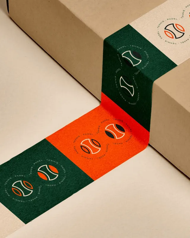
Paddle tennis brand identity system with a minimalist geometric mark based on a stylized tennis court, applied to coordinated stationery in forest green, burnt orange, and cream.
Summary
Paddle tennis brand identity with a minimalist geometric mark based on a tennis court, applied to coordinated stationery in forest green, burnt orange, and cream.
Visual description
A brand identity system for a paddle tennis brand applied across a zigzag arrangement of cardboard stationery. The mark is a stylized tennis court rendered in outline form within concentric circular badges, white and negative space on colored grounds. The palette alternates between forest green, burnt orange, cream, and tan panels. Curved text wraps around each circular badge in small sans-serif type. The stationery overlaps diagonally, creating a sculptural composition that showcases the mark's consistency across all color variations while maintaining spatial depth.
Key takeaway
The geometric court-diagram mark is minimal enough to work at badge scale. The color alternation (two colors, two neutrals) creates brand recognition without overwhelming. The wrapping circular text reinforces the badge structure while staying legible at small sizes.
Reuse notes
Strong for sports or wellness brands needing a geometric, badge-based mark system. The layered diagonal arrangement works well in product photography or packaging mockups. Forest green and burnt orange pairs well with cream substrates on anything from tennis gear to lifestyle products.
More like this



Keep what you find
A free account saves references to boards and can send you a weekly email of picks based on what you save.
To see every result, go Pro.