Preview image. Unlock full-res
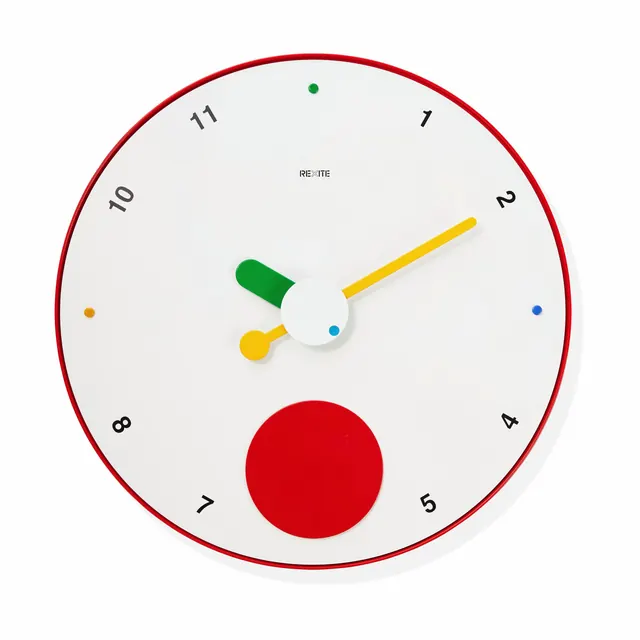
Clean minimalist clock face with red outer ring, numbered markers, and colored geometric clock hands on a light gray background.
Summary
Minimalist product design concept of an analog clock with a bold red border, geometric colored hands, and a light gray face with numbered hour markers.
Visual description
Circular clock face with a thick red border on a light gray background. Black numerals (1-12) mark each hour position, with colored dots (orange, blue, green) at offset positions adding a playful accent. Three geometric clock hands in different colors: a yellow minute hand, a green hour hand (shaped like a trapezoid), and a blue center point. A large solid red circle sits in the lower center of the dial, breaking the traditional symmetry. The overall aesthetic is contemporary and minimal, using a restrained palette of red, yellow, green, blue, and neutrals. The typography is clean sans-serif, and the design balances functional clarity with subtle creative touches.
Key takeaway
The use of asymmetrical geometric forms (the trapezoid hour hand, the off-center red circle) in an otherwise symmetrical dial. The accent color dots that guide the eye without cluttering. The restraint of using only essential elements while adding unexpected color and shape to a familiar object. The interplay between functional (readable numerals) and playful (geometric hand forms).
Reuse notes
Strong reference for product design, watch faces, or interface graphics. The minimal approach with color accents works across disciplines. Good example of how to make a utilitarian object memorable through subtle geometric variation. The red color scheme reads as energetic yet calm due to the white background and restrained application. Works well for branding or educational materials exploring design systems.
More like this






Keep what you find
A free account saves references to boards and can send you a weekly email of picks based on what you save.
To see every result, go Pro.