Preview image. Unlock full-res
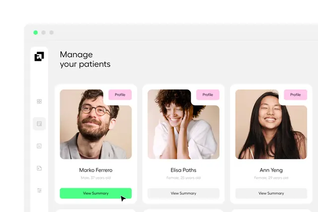
Patient management interface using three-column card grid with portrait photos, colored profile badges, and warm neutral palette.
Summary
Patient management interface using three-column card grid with portrait photos, colored profile badges, and warm neutral palette.
Visual description
Light gray-beige background with a vertical sidebar on the left containing iconography. Main content area shows a horizontal grid of three patient cards in soft cream-beige containers with rounded corners. Each card displays a portrait photo, patient name, demographic info (age/gender), a bright pink "Profile" action button, and a bright green "View Summary" button below. The cards sit on a light background with subtle shadows, creating clear visual separation. A green accent dot in the window chrome reinforces brand color.
Key takeaway
The warm, human-forward palette (cream and soft caramel tones) on healthcare software makes it feel more approachable than cold blues. The mix of one bright primary action (green) and secondary buttons (gray) in each card creates clear affordance hierarchy.
Reuse notes
Works well for patient, customer, or team-member management interfaces where photos and identity matter. The card grid scales cleanly to 2-4 columns and pairs well with a sidebar navigation.
More like this









Keep what you find
A free account saves references to boards and can send you a weekly email of picks based on what you save.
To see every result, go Pro.