Preview image. Unlock full-res
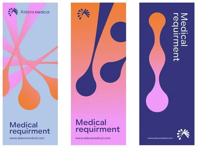
Three-card identity system for a medical brand using flowing organic shapes and vibrant pink-to-blue gradients to express movement and interconnection.
Summary
Three vertical branded cards for Aldora Medical, each using flowing organic teardrop shapes and smooth gradients to express medical or biological concepts in a contemporary healthcare aesthetic.
Visual description
Three portrait-format cards arranged in a row, each with a distinct gradient background: left card transitions from soft blue to hot pink, center from coral to pink, right from navy to pink. Overlaid on each is a flowing organic shape (a teardrop or bulb form) in contrasting colors. The left card features the Aldora Medical logo (a star icon) at the top left and text "Medical requirement" in navy at the bottom. Center and right cards have the same text in white at the bottom and the star icon at the top or bottom. Typography is clean sans-serif in either navy or white depending on background.
Key takeaway
Flowing organic shapes feel approachable and warm compared to hard geometry, perfect for healthcare brands that need to feel both innovative and trustworthy. The gradient backgrounds and shape placement create a sense of movement and interconnection across the card series.
Reuse notes
Works well for medical device, biotech, or pharmaceutical brands where you need to convey innovation without coldness. The card format scales to any number of sections or product lines, and the organic-shape approach differentiates easily from minimalist competitors.
More like this








Keep what you find
A free account saves references to boards and can send you a weekly email of picks based on what you save.
To see every result, go Pro.