Preview image. Unlock full-res
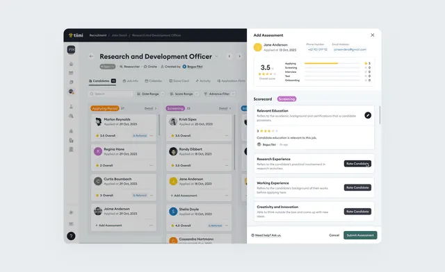
HR or talent assessment platform interface showing a job profile (Research and Development Officer) with skill ratings and experience tracking in a clean, data-dense layout.
Summary
HR or talent assessment platform interface showing a job profile (Research and Development Officer) with skill ratings and experience tracking in a clean, data-dense layout.
Visual description
Two-column interface with a dark sidebar on the left (nearly black) showing a filtered job list including profile photos, role titles, and star ratings in colored badges (orange, purple, teal). The main content area on the right displays "Research and Development Officer" as the active profile header with a date (3 months). Below are large metric cards showing skill ratings (3.5 average with stars), a "Resources" section flagged in purple, and a "Knowledge Experience" section listing job requirements with toggle switches and a "Request Full Fit Ai" button in dark teal. The top right shows an "Add Assessment" modal panel with similar form elements. Color scheme is monochromatic grays (#E9EDF1 background, #4D4D53 text) with accent colors for badges and buttons (orange, purple, teal). Typography is clean, small sans-serif for labels and medium for hierarchy. No imagery, pure data visualization and form inputs.
Key takeaway
A two-column layout (list sidebar plus main content) scales well to many items without overwhelming the interface. Using colored badges as the only visual hierarchy element keeps the design focused on data. Toggle switches and simple rating systems convey complexity without visual noise.
Reuse notes
Standard pattern for talent management, recruitment, and assessment platforms where users compare or evaluate many items. Works well for internal tools where users understand the domain. Adapt the badge colors to your brand system; the structure stays consistent across any data type.
More like this





Keep what you find
A free account saves references to boards and can send you a weekly email of picks based on what you save.
To see every result, go Pro.