Preview image. Unlock full-res
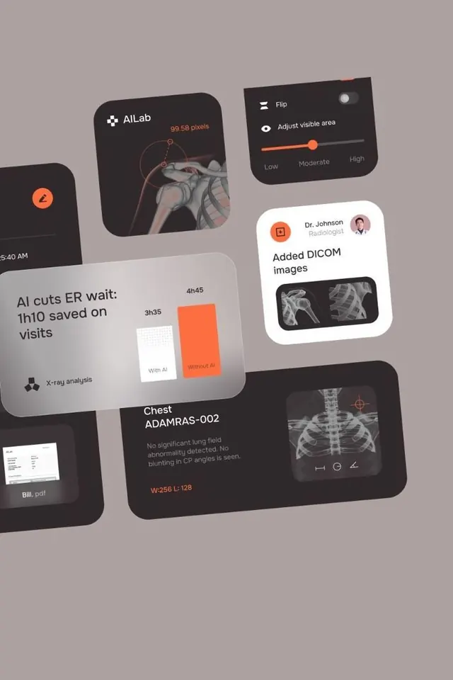
Medical diagnostic software dashboard scattered across rounded dark and light card components, with orange accent controls and x-ray imaging.
Summary
Medical diagnostic software UI composed of floating rounded-card components: x-ray imaging with measurement overlays, comparison charts (AI vs. non-AI wait time metrics), patient case details, and adjustable imaging controls on a neutral gray canvas.
Visual description
A scattered mockup layout on a muted taupe ground showing multiple dark charcoal and cream-colored rounded rectangular cards. Card contents include: an x-ray image marked with measurement arcs, a bold orange toggle slider labeled "Adjust visible area", a card titled "Dr. Johnson" with patient avatar and "Added DICOM images" beneath x-ray thumbnails, a bar chart comparing "AI cuts ER wait: 1h10 saved on visits" in dark and orange bars, a card labeled "Chest ADAMRAS-002" with clinical annotation text and radiologic measurements in orange type, and fragments of other UI elements. Sans-serif typography in light gray and white provides labels and metadata. Orange serves as the call-to-action accent throughout.
Key takeaway
Floating-card composition breaks free from rigid dashboard grids, lending a research or exploratory feeling while keeping information chunked and readable. Orange as a single accent color focuses attention on interaction points (sliders, buttons, metrics) without overwhelming the dark palette. X-ray imagery layered with UI creates a concrete, technical credibility.
Reuse notes
Ideal for healthcare SaaS, medical imaging software, diagnostic tools, or clinical decision support interfaces. The scattered layout works well in presentation mockups and design portfolios. Cards could be repositioned or animated to reveal additional data. Not suited to dense, mission-critical dashboards requiring stability and consistent layout.
More like this





Keep what you find
A free account saves references to boards and can send you a weekly email of picks based on what you save.
To see every result, go Pro.