Preview image. Unlock full-res
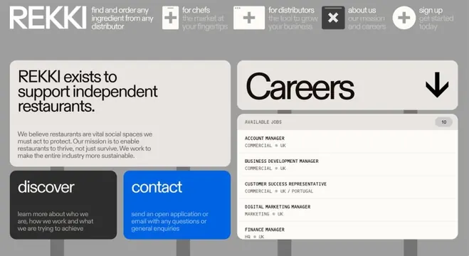
B2B food-supply interface showing a careers section with structured job listings, using clean sans-serif typography, muted card layouts, and a single bright blue CTA button for applications.
Summary
A B2B careers page for REKKI, an ingredient sourcing platform, showing job listings in clean muted cards with a bright blue application CTA and structured navigation header.
Visual description
A light beige background page with a grey header bar containing the REKKI wordmark on the left and a horizontal navigation menu with six items (each paired with a small icon: plus sign, plus sign, X icon, and plus sign icons for different product categories) on the right. Below, a large rounded white card contains a bold left-aligned sans-serif heading "REKKI exists to support independent restaurants" followed by a longer paragraph explaining the brand mission. To the left of this is a compact dark grey box with white text labeled "discover" linking to information about the company, and to the right is a bright blue rounded card with white text labeled "contact" with details on how to apply. On the right side, a tall pale grey card shows a "Careers" section with a small "10" badge and a bulleted list of five job openings (Account Manager, Business Development Manager, Customer Success Representative, Digital Marketing Manager, Finance Manager) each labeled with department and location tags.
Key takeaway
The pairing of muted structural cards with a single high-contrast blue CTA focuses user action without visual noise. The hierarchical use of typography (large bold mission statement, smaller job titles, micro-labels for location and department) efficiently conveys information density. The icon-based navigation system communicates product categories without text, reducing header clutter while maintaining scanability.
Reuse notes
Ideal for B2B recruitment pages and product-heavy interfaces targeting business users. The blue CTA works well against the soft beige and grey palette. Works best with 3-6 navigation items and structured job listings. The mission statement card effectively contextualizes the organization before presenting open roles.
More like this




Keep what you find
A free account saves references to boards and can send you a weekly email of picks based on what you save.
To see every result, go Pro.